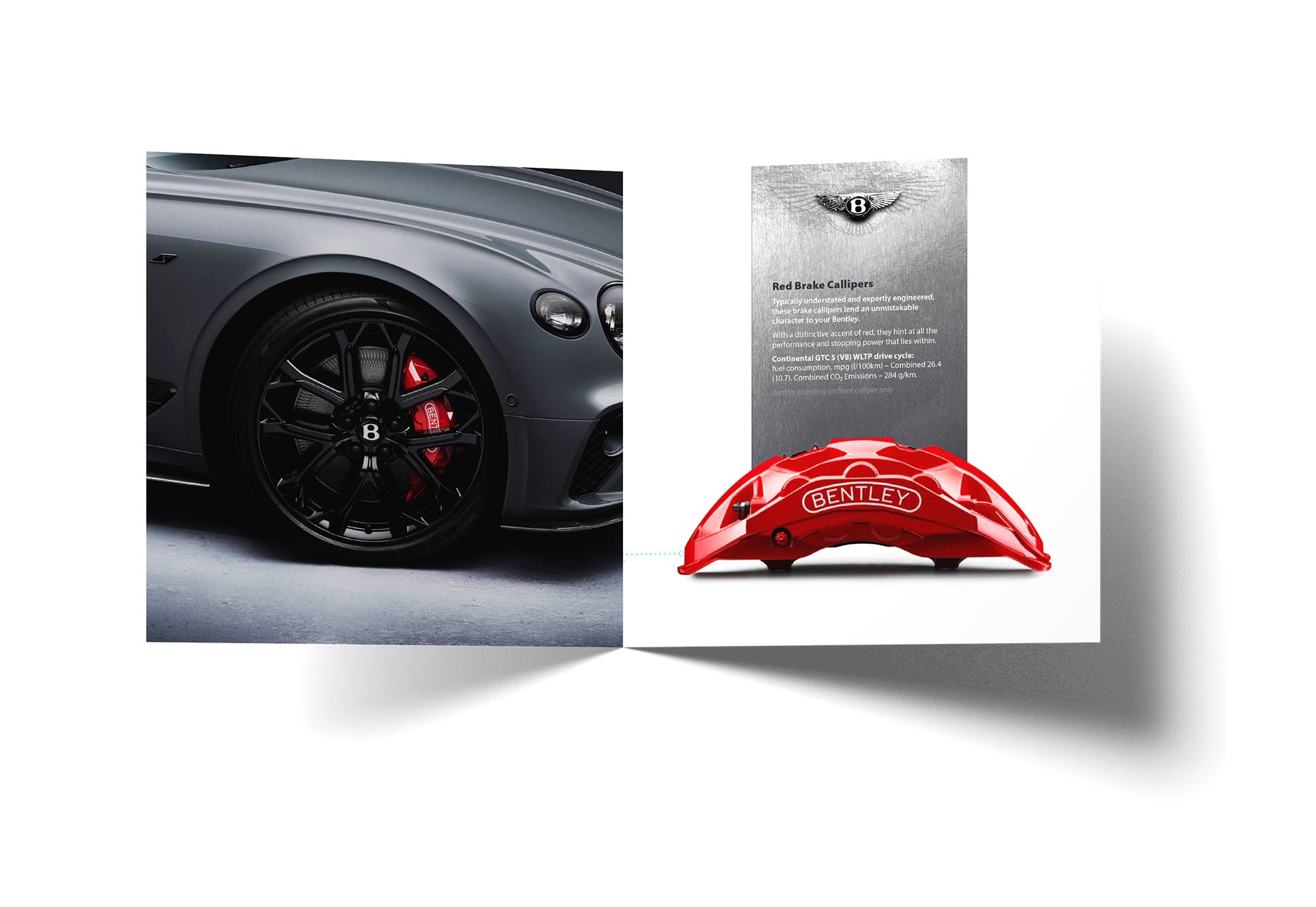
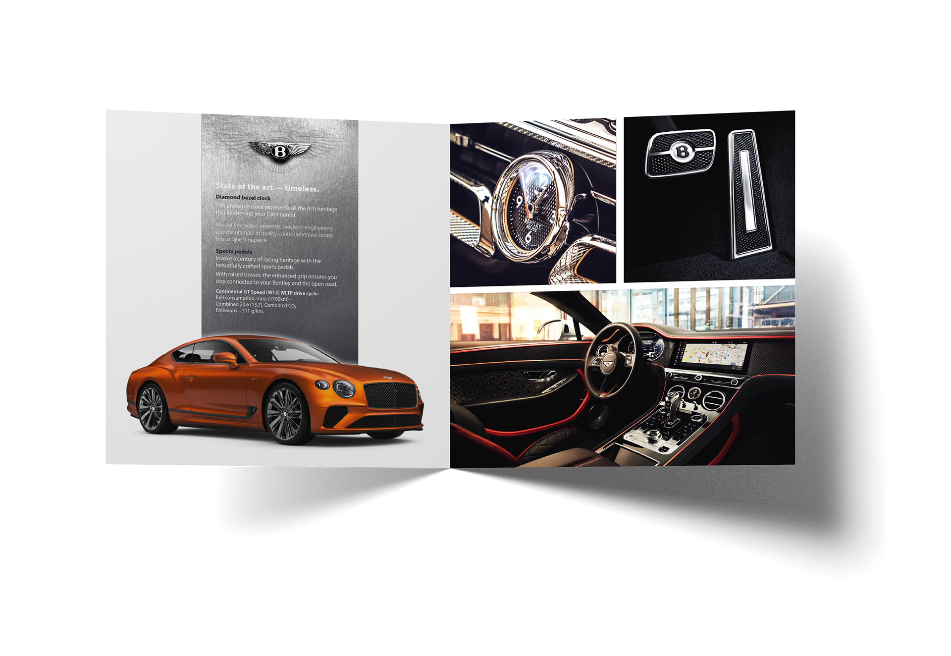
Bentley | The Continental GT Range |
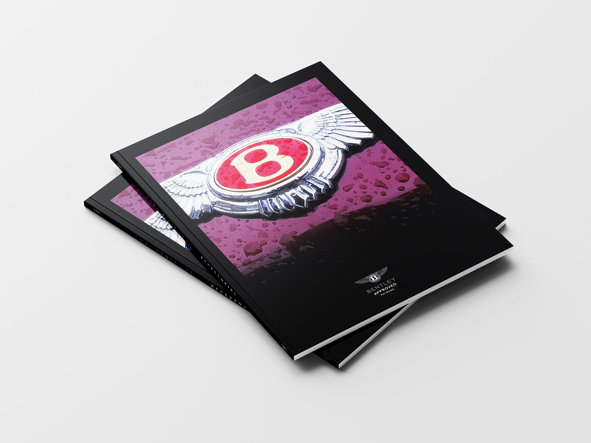
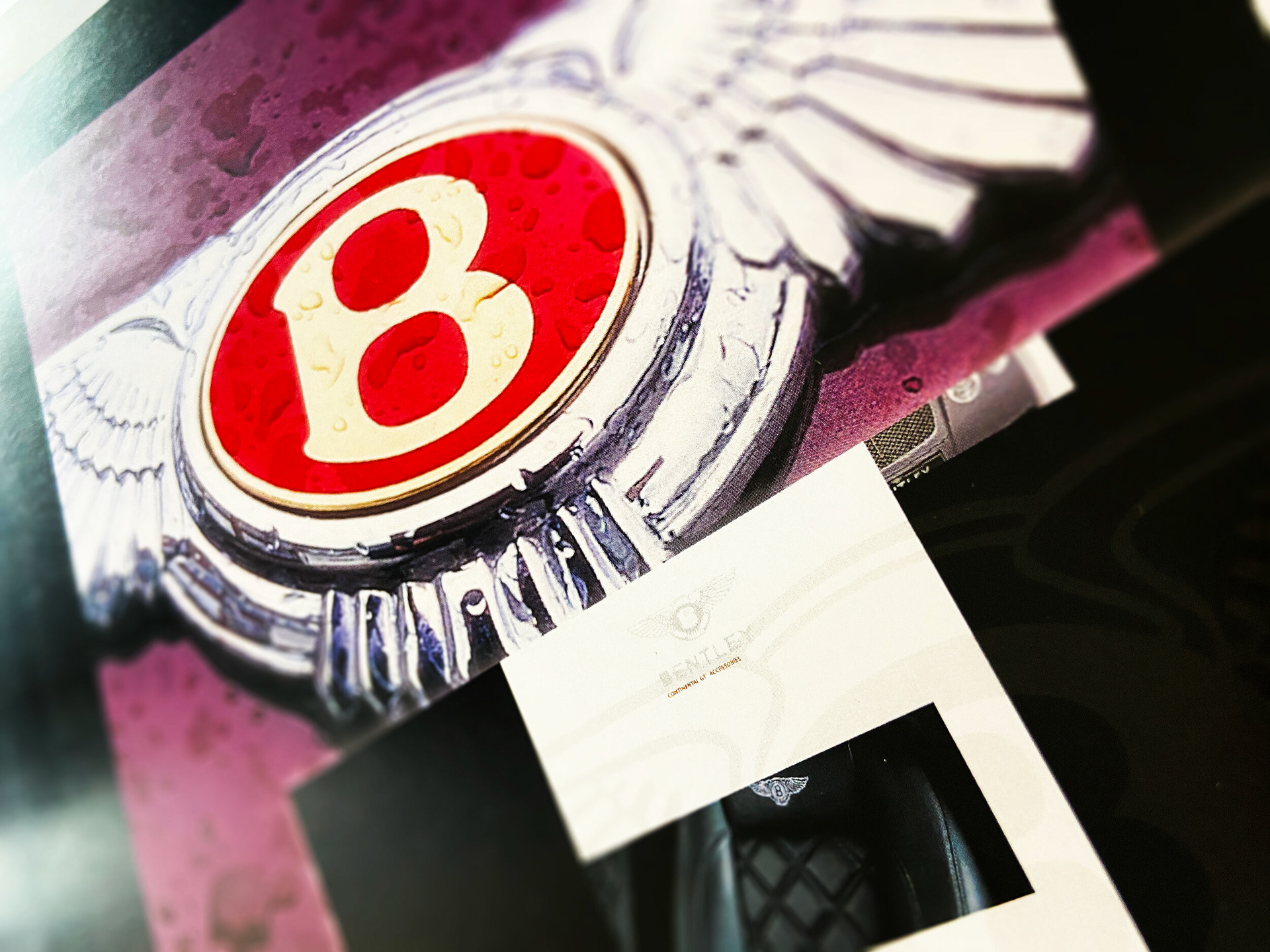
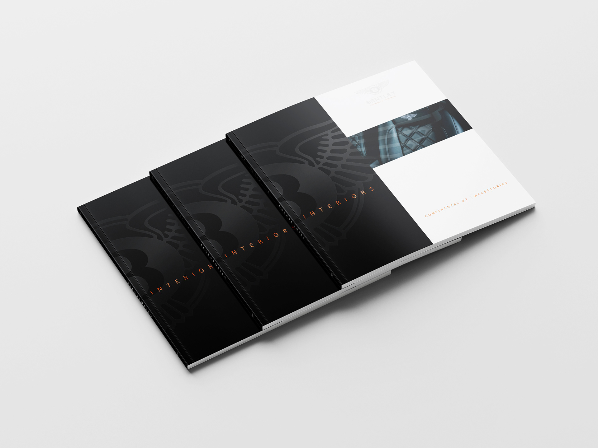
I had an exciting and creative experience working on the accessory brochure for Bentley's Continental GT Range.
Bentley is known for its luxury and craftsmanship, and my attention to detail in design and finishes reflects that ethos. Art directing the photo selection ensures that the visuals align with Bentley's brand image and the message the client wanted to convey. It's about curating a visual narrative that complements the brand.
Bentley is known for its luxury and craftsmanship, and my attention to detail in design and finishes reflects that ethos. Art directing the photo selection ensures that the visuals align with Bentley's brand image and the message the client wanted to convey. It's about curating a visual narrative that complements the brand.
CONCEPT | ART DIRECTION | LAYOUT | DESIGN | TYPOGRAPHY | ARTWORK
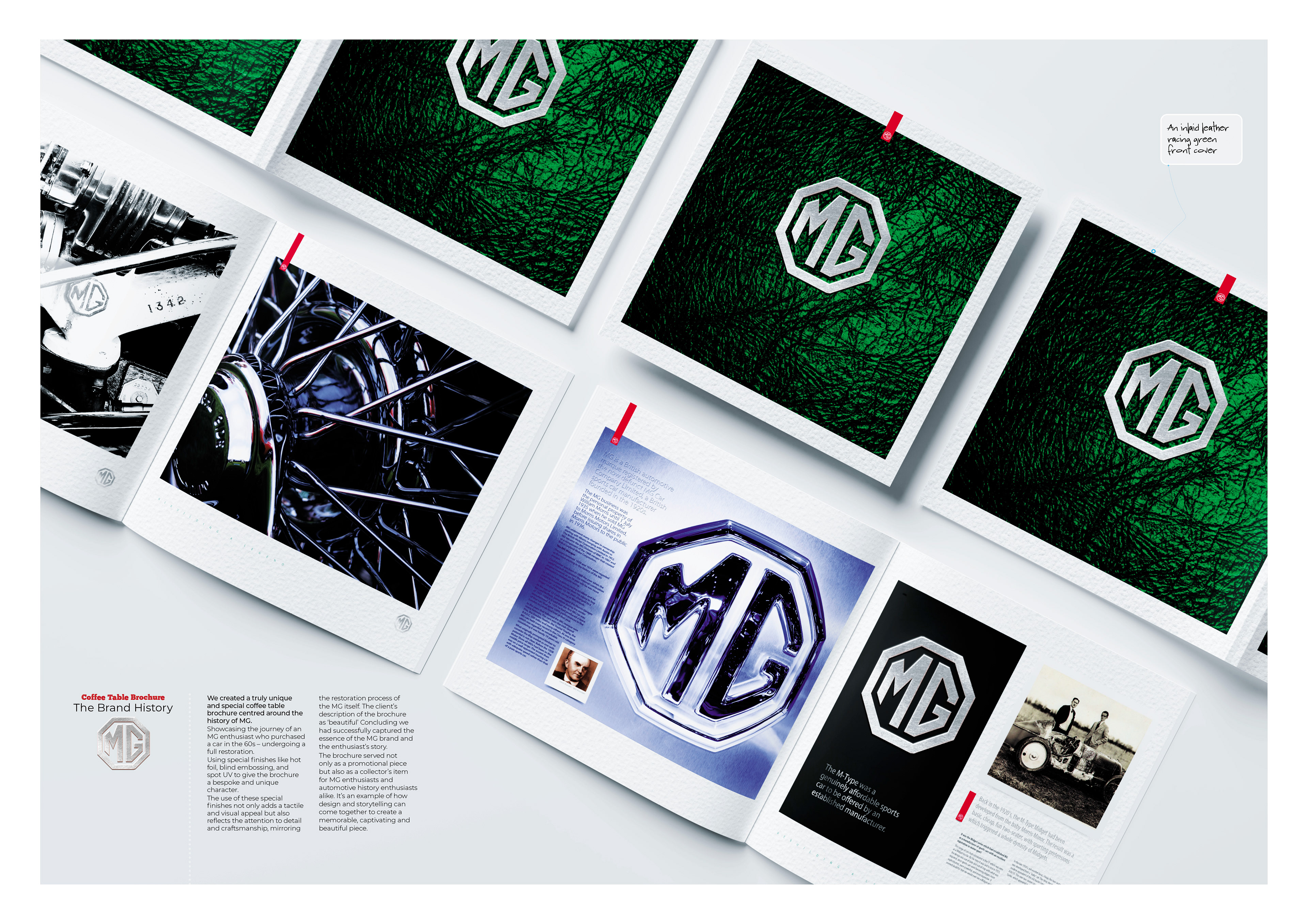
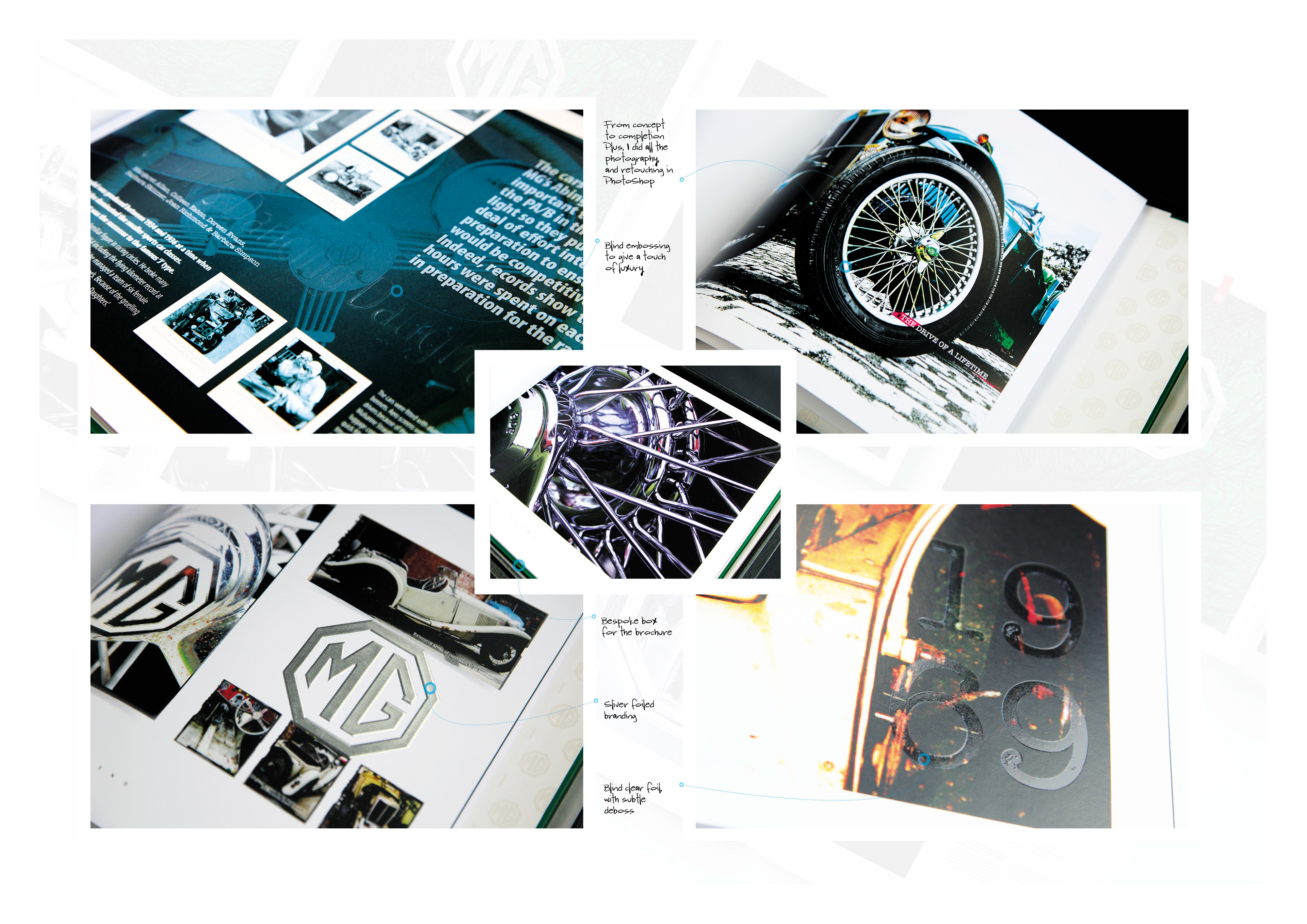
MG | The Brand History – Coffee Table Brochure |
We created a truly unique and special coffee table brochure centred around the history of MG.
Showcasing the journey of an MG enthusiast who purchased a car in the 60s – undergoing a full restoration.
Using special finishes like hot foil, blind embossing, and spot UV to give the brochure a bespoke and unique character.
Showcasing the journey of an MG enthusiast who purchased a car in the 60s – undergoing a full restoration.
Using special finishes like hot foil, blind embossing, and spot UV to give the brochure a bespoke and unique character.
The use of these special finishes not only adds a tactile and visual appeal but also reflects the attention to detail and craftsmanship, mirroring the restoration process of the MG itself. The client’s description of the brochure as ‘beautiful’ concluding we had successfully captured the essence of the MG brand and the enthusiast’s story.
CONCEPT | ART DIRECTION | LAYOUT | DESIGN | TYPOGRAPHY | ARTWORK
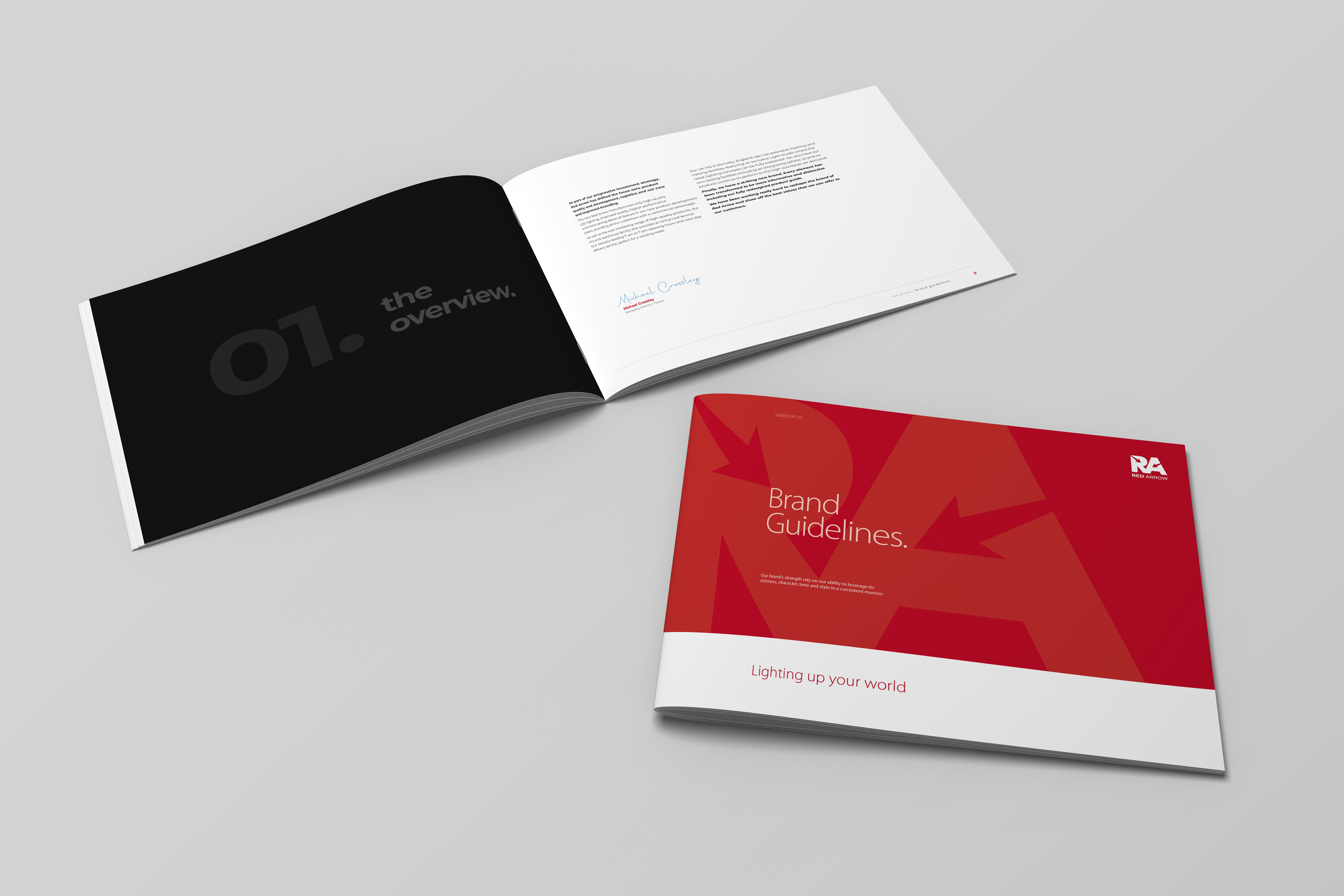
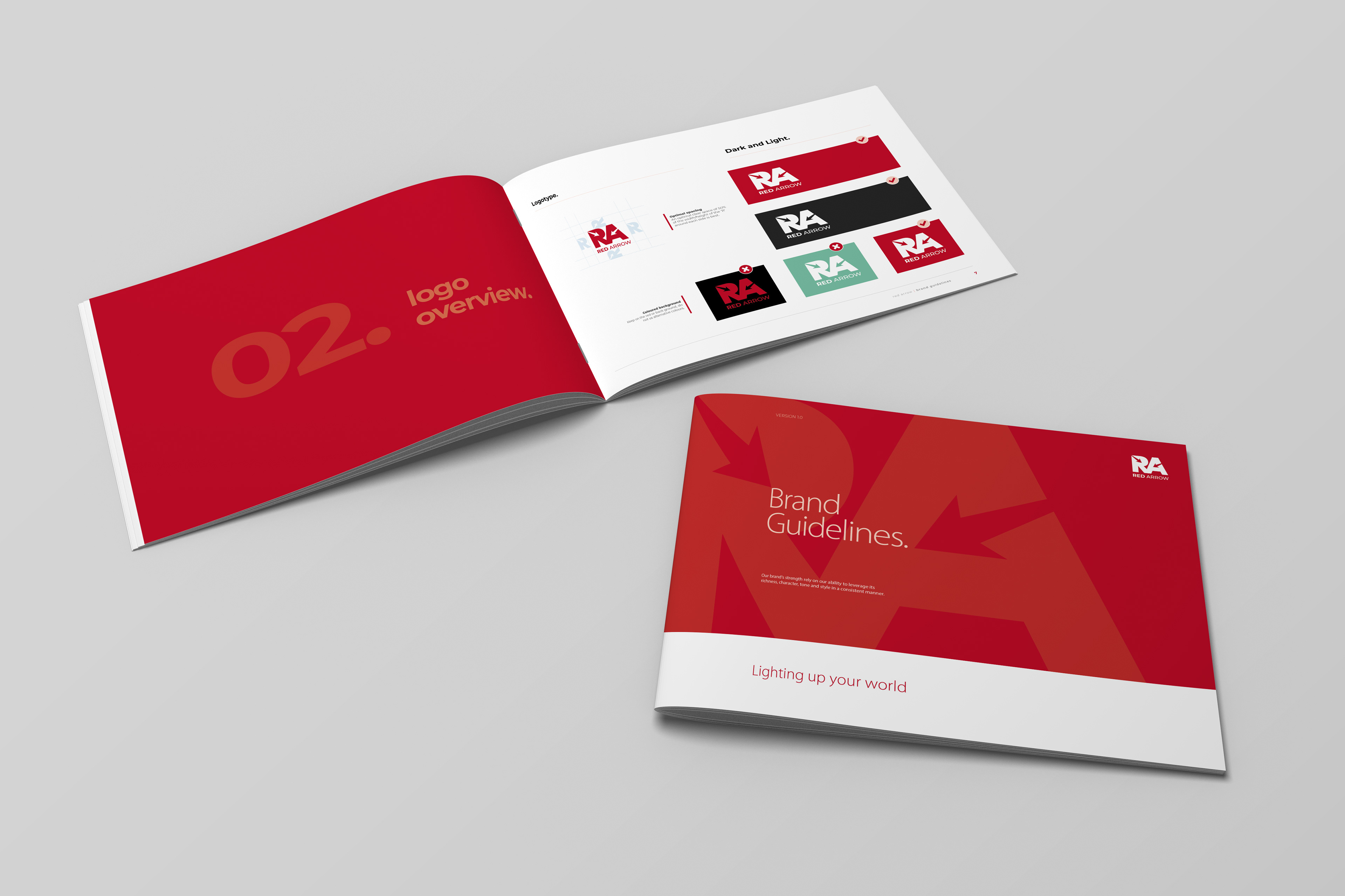
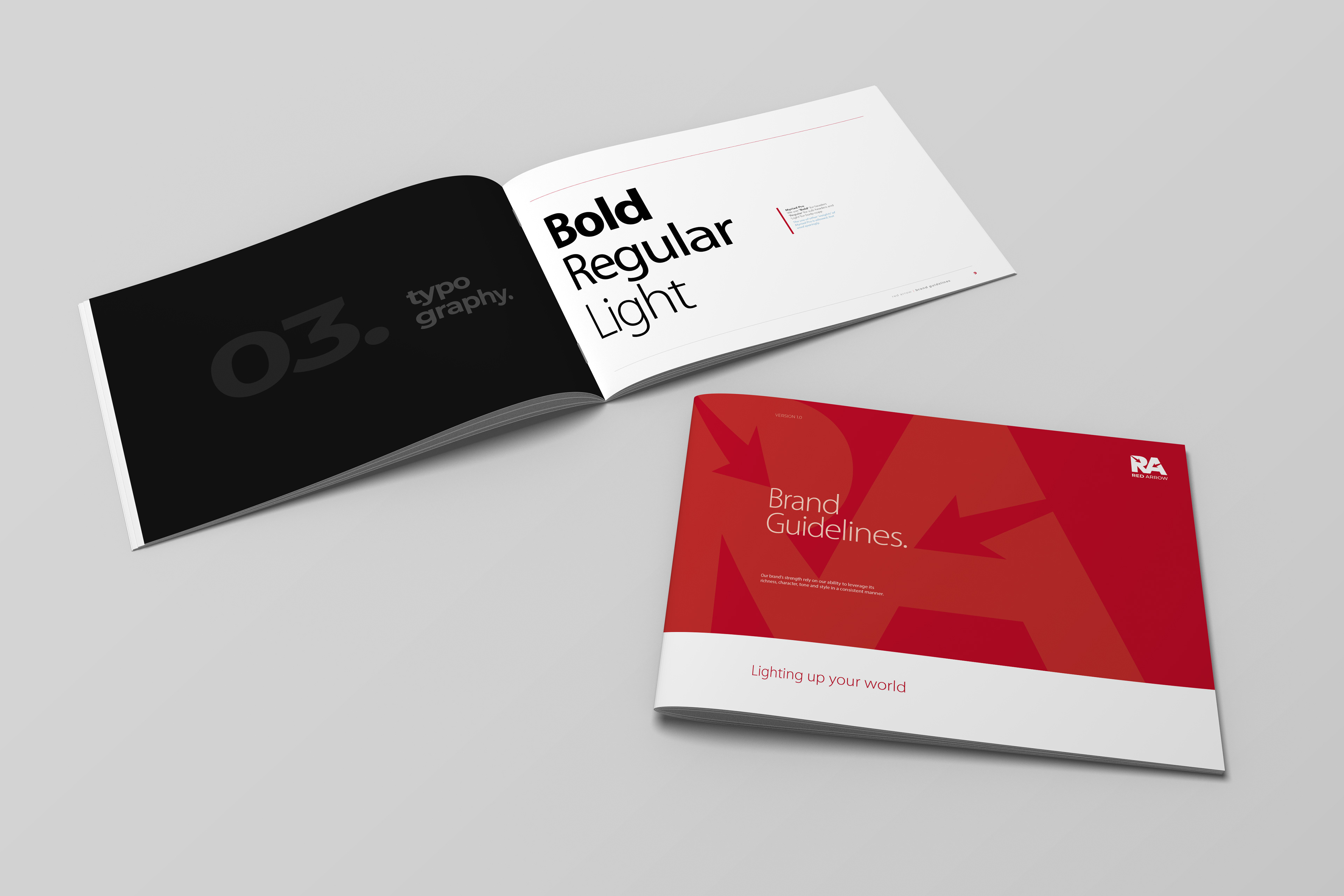
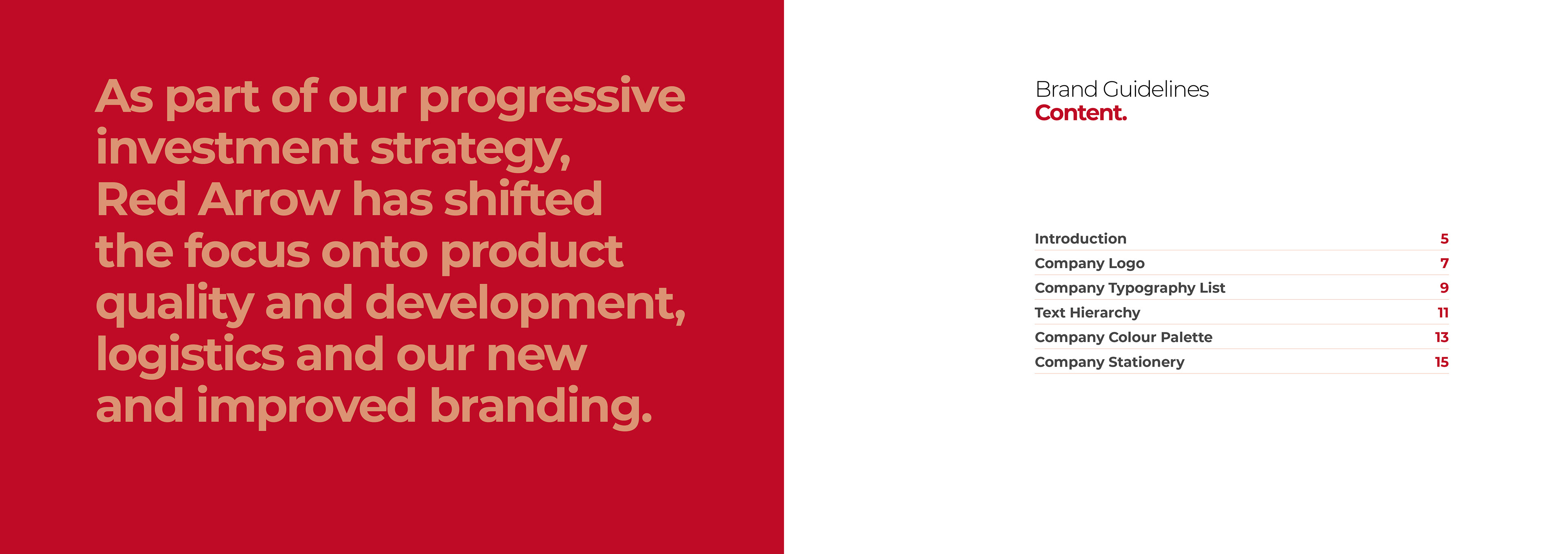
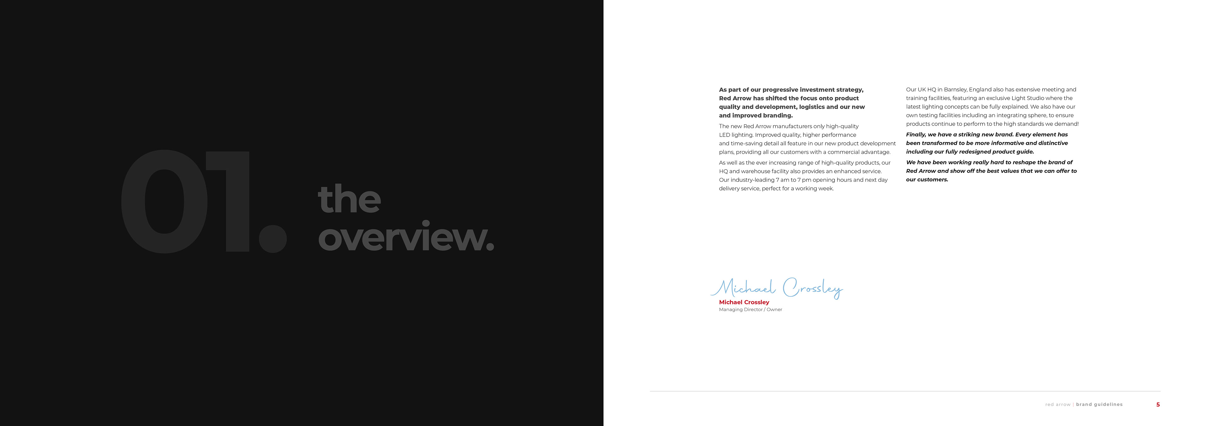
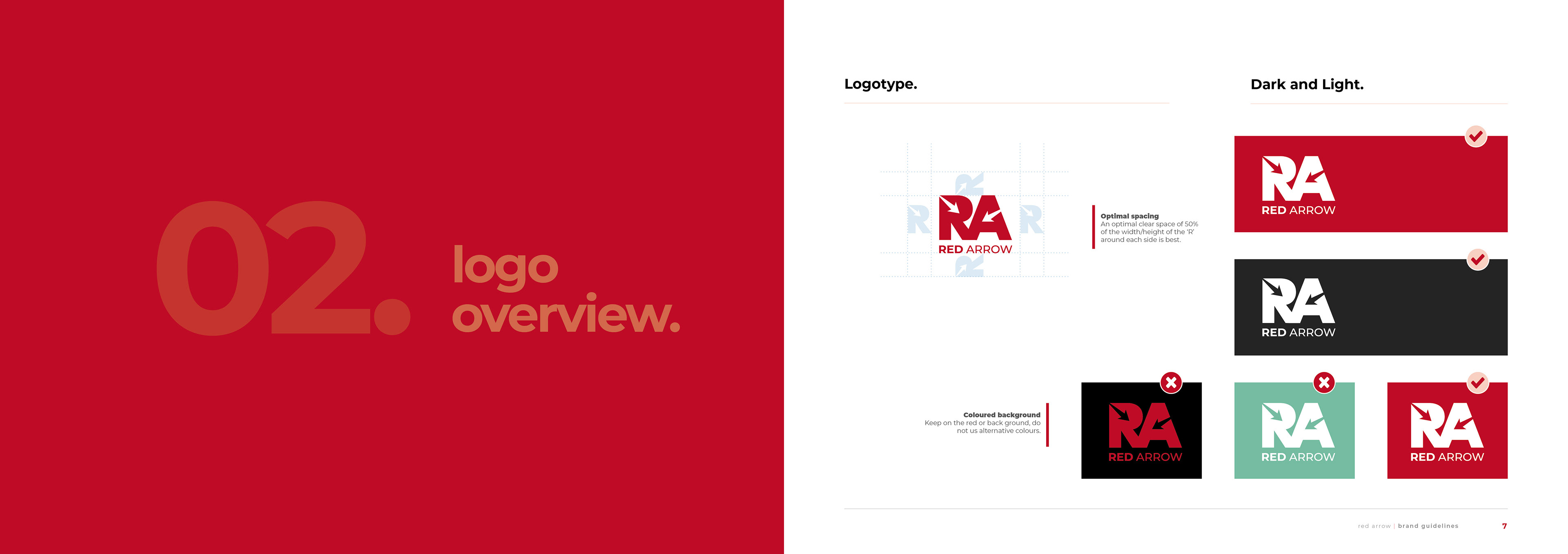
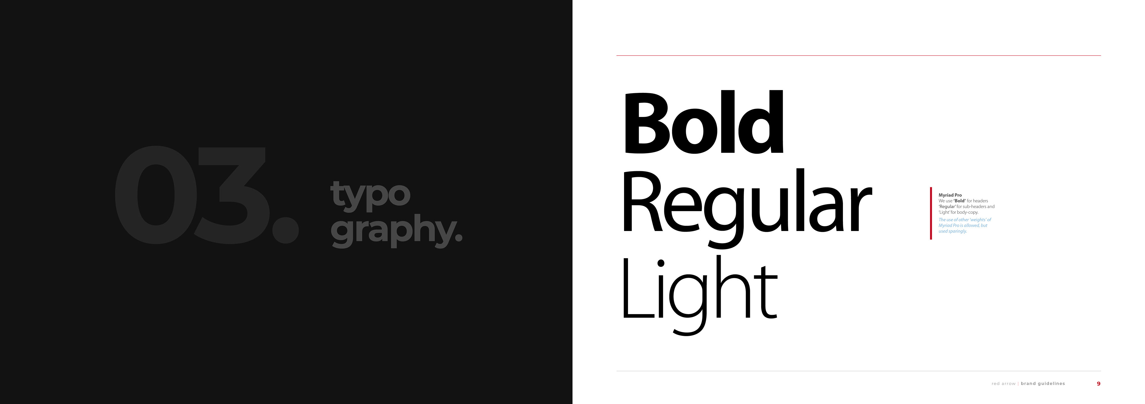
Red Arrow | Branding Guidelines |
I developed a customised and straightforward set of branding guidelines for RA, encompassing essential typographic and colour specifications for seamless integration of the brand. Additionally, the guidelines outline permissible and impermissible practices regarding the utilisation of the branding.
CONCEPT | ART DIRECTION | LAYOUT | DESIGN | TYPOGRAPHY | ARTWORK
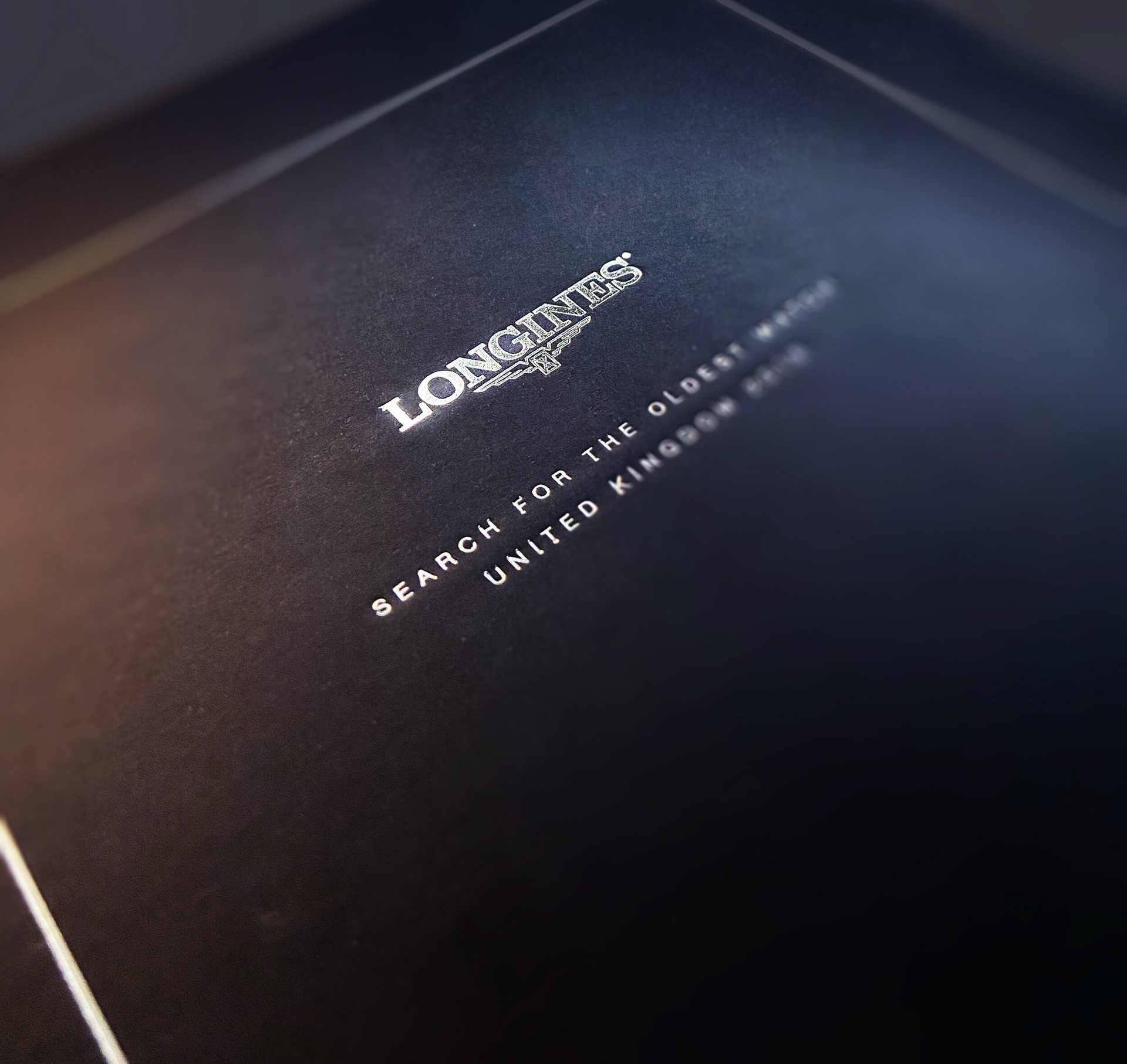
Longines | Bespoke Die-Cut Table Top Brochure |
Designing a bespoke brochure for Longines with the theme "Search For The Oldest Watch" was a creative and sophisticated project. My attention to detail and use of intricate design techniques, I hope, demonstrated my commitment to delivering a high-quality product.
The client's enthusiastic response, describing the end product as "Beautiful," was a testament to the successful execution of their vision and my commitment to meeting their expectations.
CONCEPT | ART DIRECTION | LAYOUT | DESIGN | TYPOGRAPHY | ARTWORK

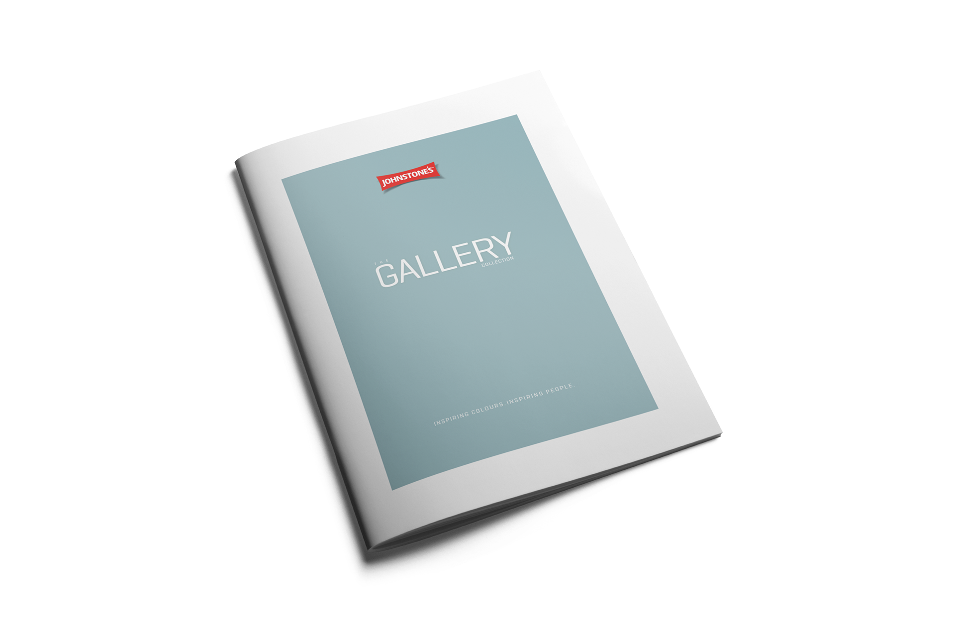
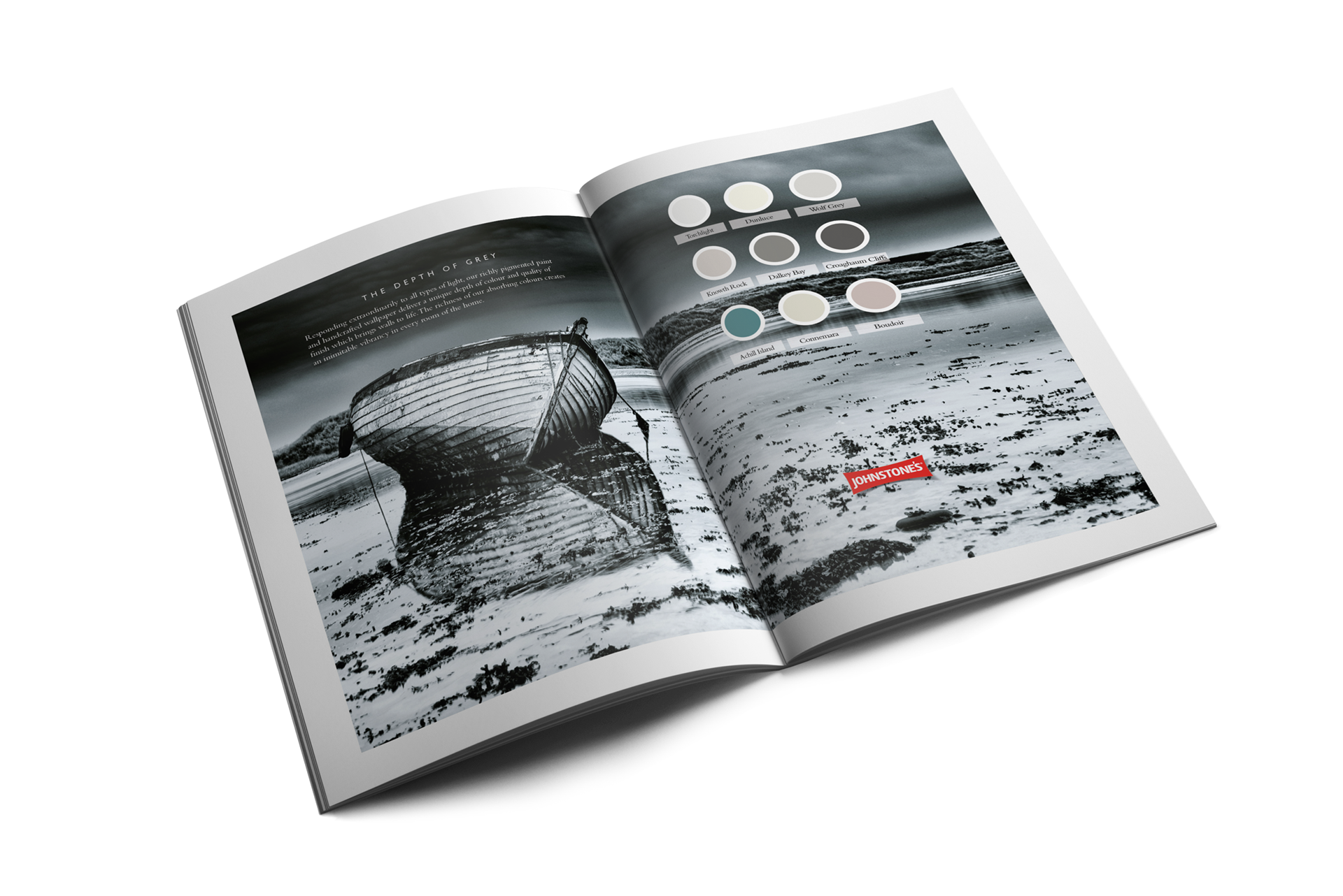
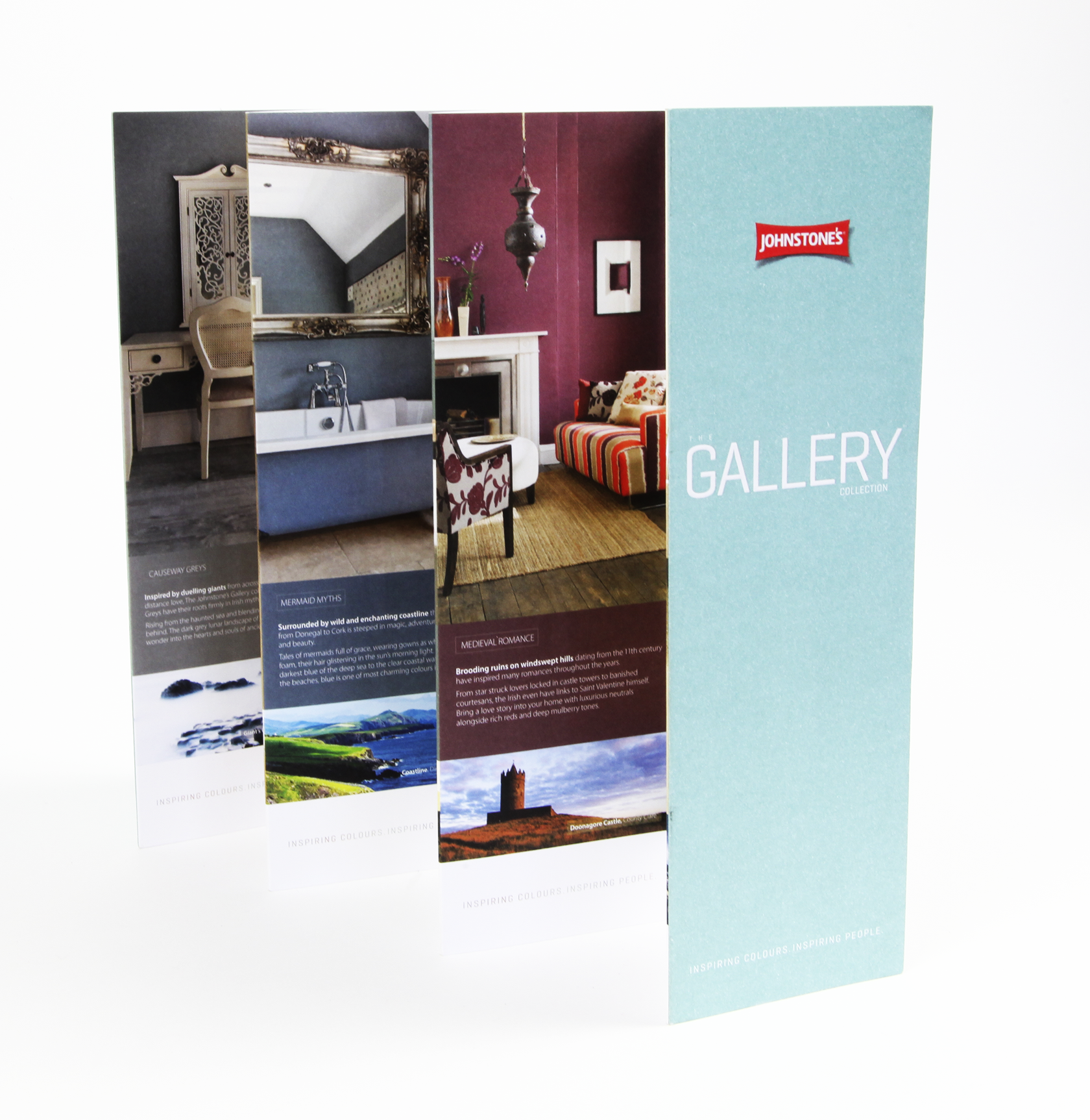
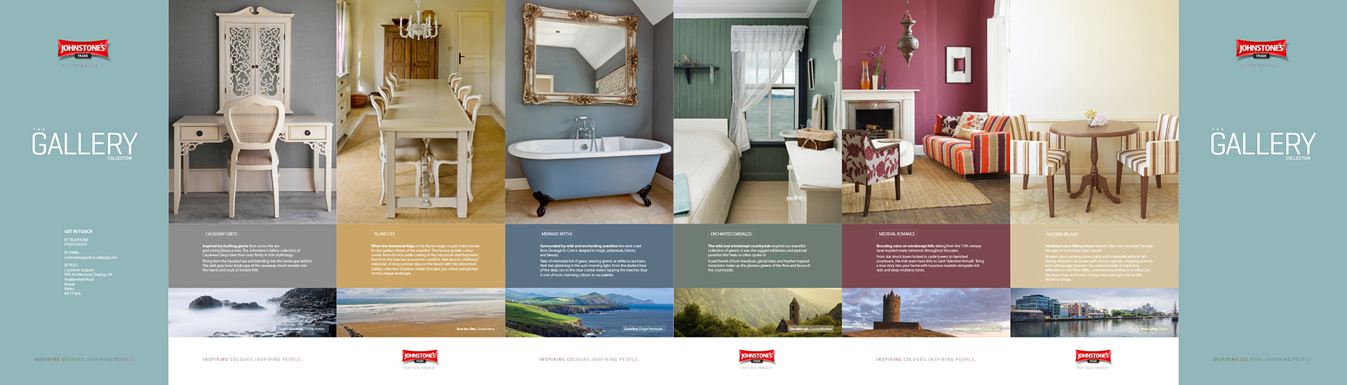
Johnstone's Trade | (PPG) |
I designed a seven-fold swatch and mini-brochure for Johnstone's Trade Gallery Collection, featuring pastel and subtle colours, demonstrates my ability to showcase a product's visual appeal in an engaging and practical manner. It's a practical tool for professionals in the design and construction industry.
The mini-brochure not only showcases the colours but also educates users on their practical applications, helping them make informed decisions. The design and presentation align with Johnstone's Trade brand identity, reflecting professionalism and attention to detail.
CONCEPT | ART DIRECTION | LAYOUT | DESIGN | TYPOGRAPHY | ARTWORK
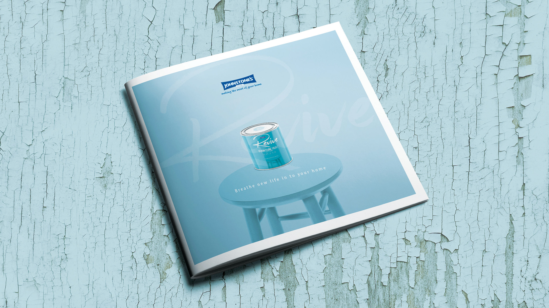
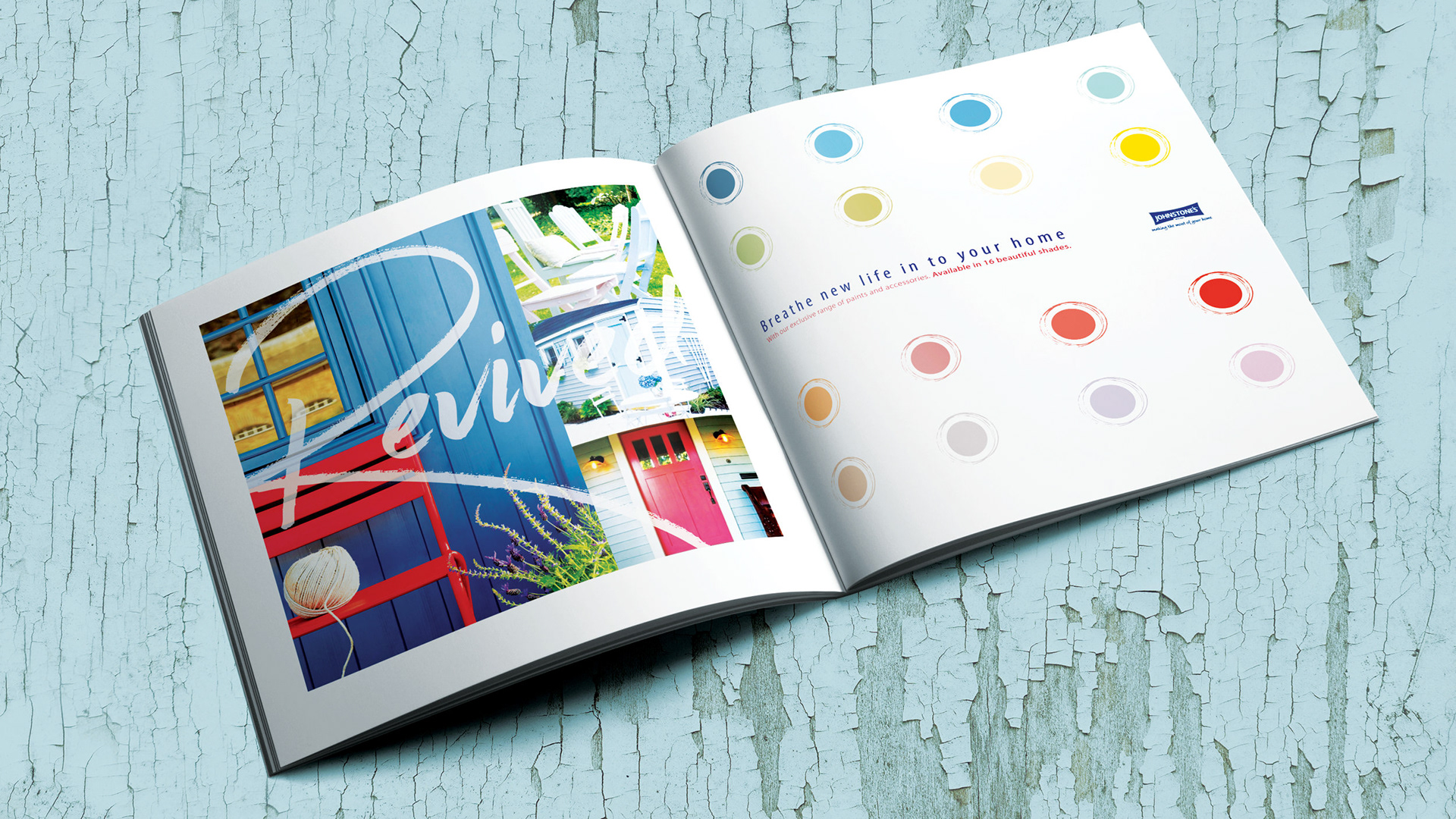
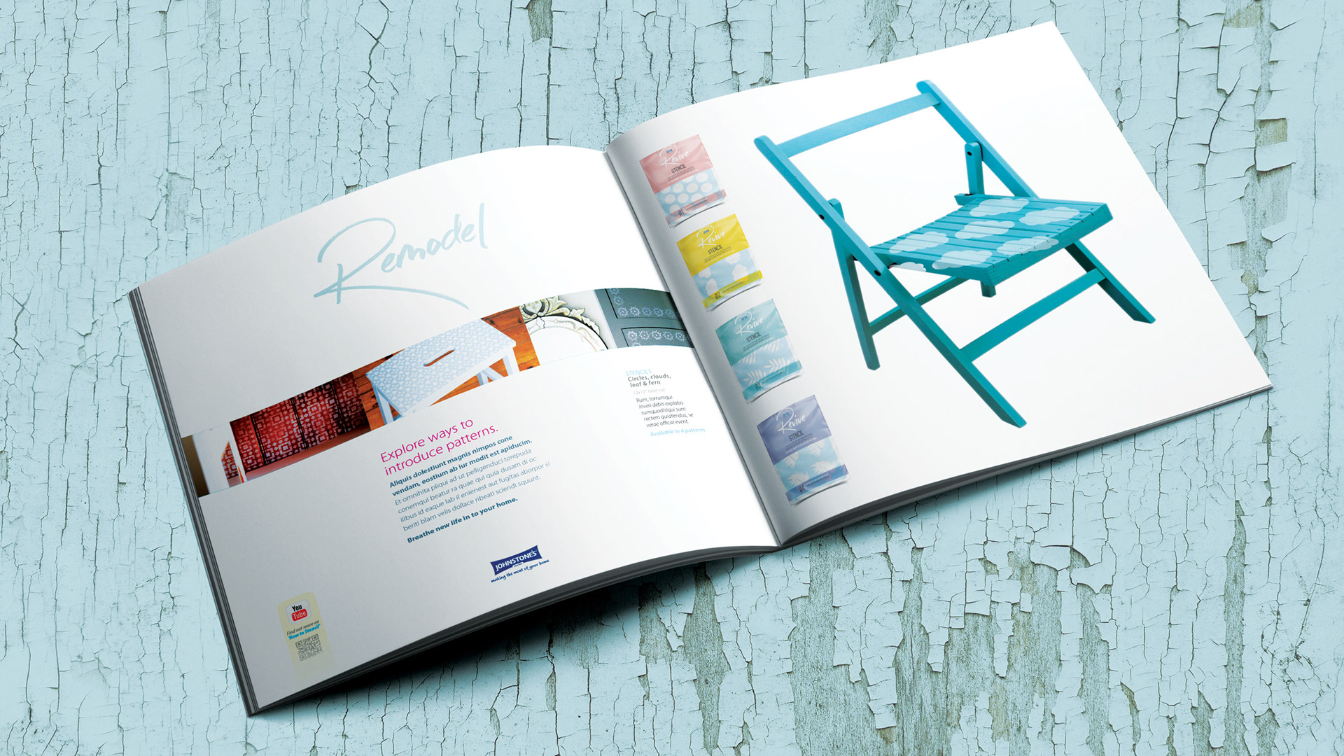
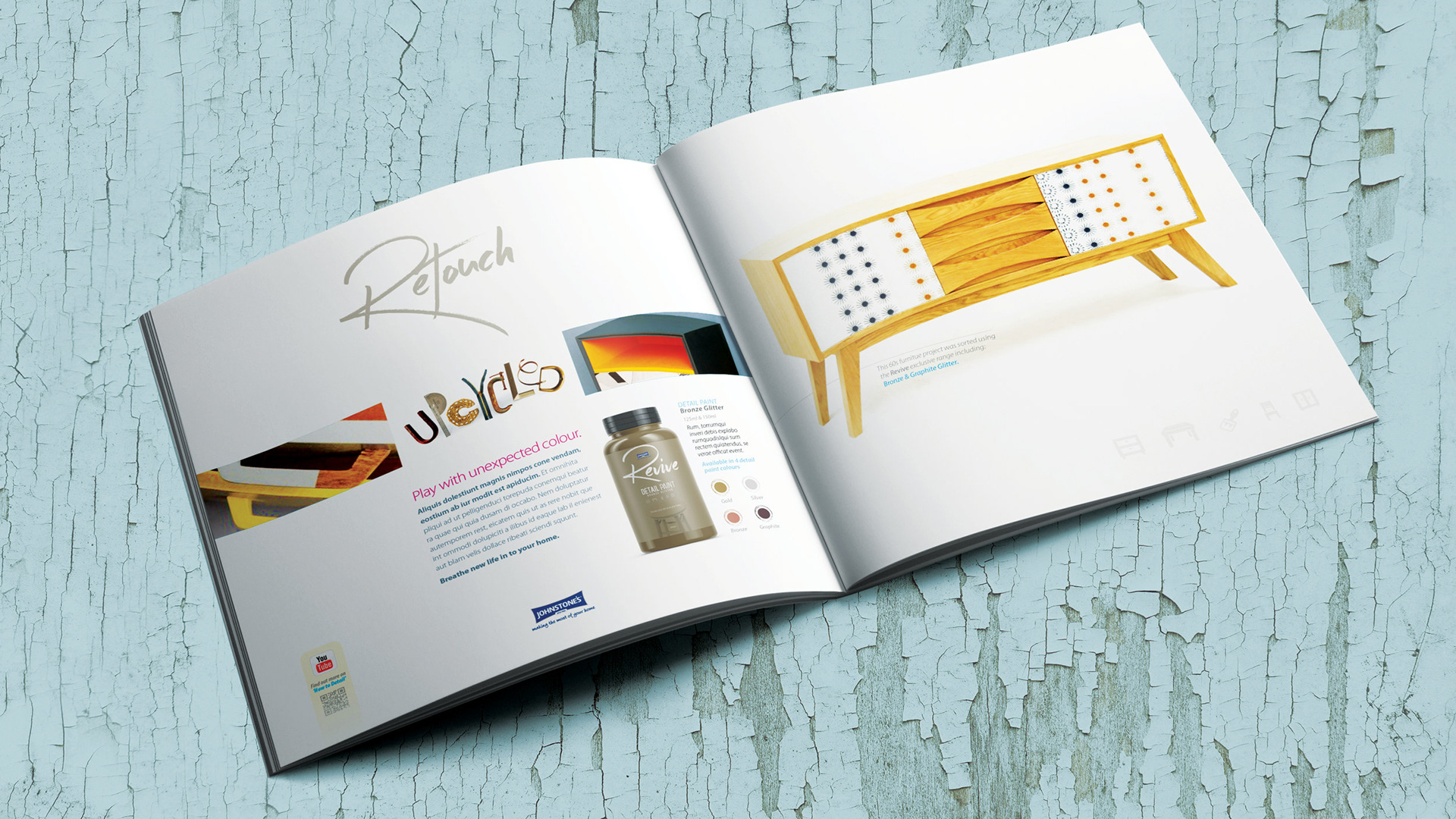
Johnson's | Revive (PPG) |
Developing a strong, iconic branding concept for Johnson's Revive, particularly for its application in reviving old items, including furniture, was greatly received by the client. Effective branding is crucial for communicating a product's unique value proposition and attracting the target audience.
Creating an iconic branding concept implies that I crafted a memorable and visually striking identity for Johnson's Revive. An iconic brand is more likely to be recognised and remembered by consumers.
CONCEPT | ART DIRECTION | LAYOUT | DESIGN | TYPOGRAPHY | ARTWORK
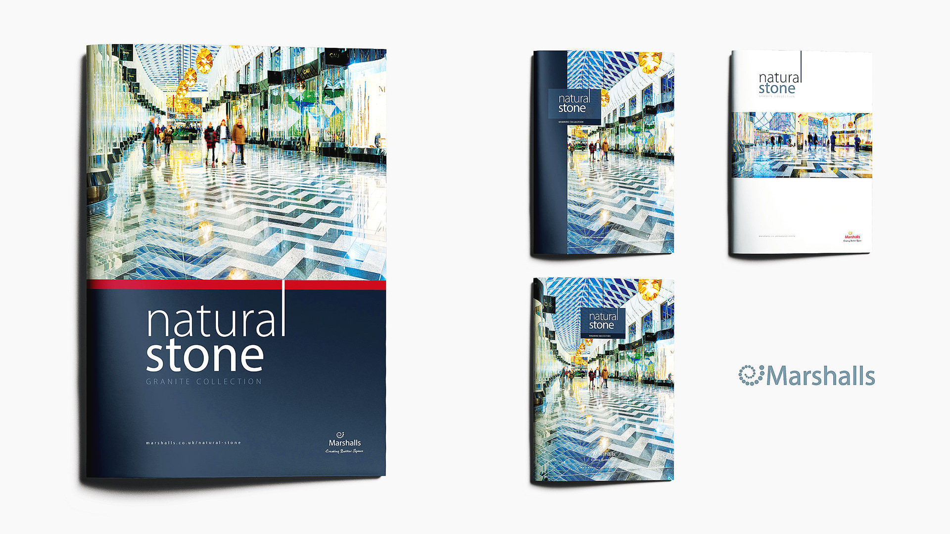
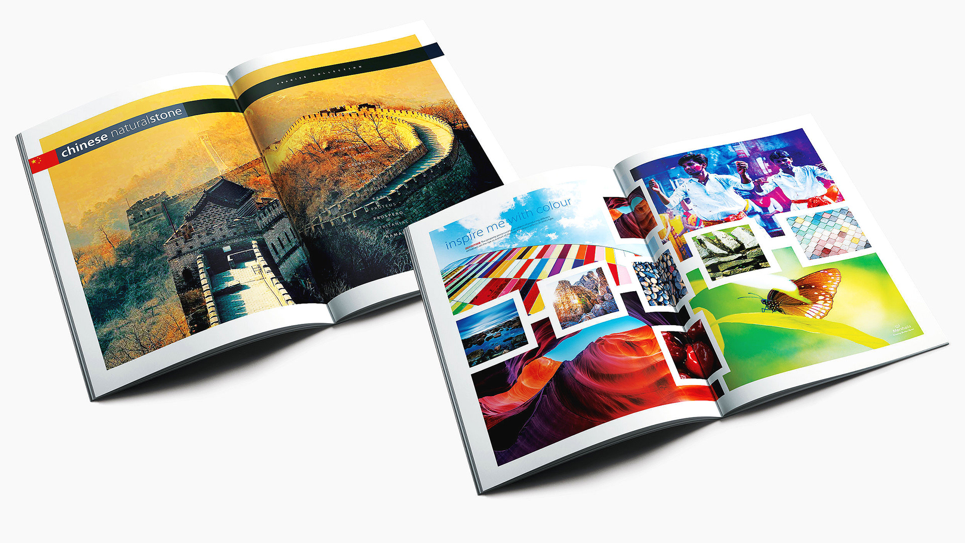
Marshalls PLC | Natural Stone Brochure |
I created a strongly branded yet user-friendly brochure for Marshalls PLC, a manufacturer of natural stone and concrete products, presents a valuable marketing tool for specifiers. It's essential to provide a smooth and informative experience for specifiers as they navigate through the brochure.
Clear branding was an essential narrative for the brochure and should prominently feature Marshalls PLC branding elements, such as the logo, colour scheme, and typography, to reinforce brand identity.
CONCEPT | ART DIRECTION | LAYOUT | DESIGN | TYPOGRAPHY | ARTWORK
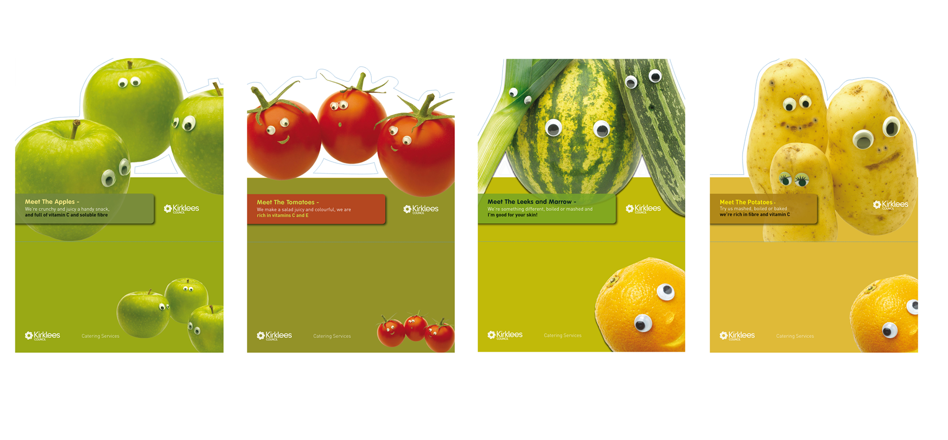
Kirklees Council | Bespoke Cut-Out Table Toppers |
My creative solution for Kirklees Council to promote healthy eating among children by using pop-up, cut-out cafe table toppers is both innovative and effective. Achieving a 400% increase in fruit and vegetable consumption among kids was a remarkable outcome.
Placing the table toppers on cafe tables ensured that they were highly visible to children, providing a constant reminder of the importance of eating fruits and vegetables.
CONCEPT | ART DIRECTION | LAYOUT | DESIGN | TYPOGRAPHY | ARTWORK

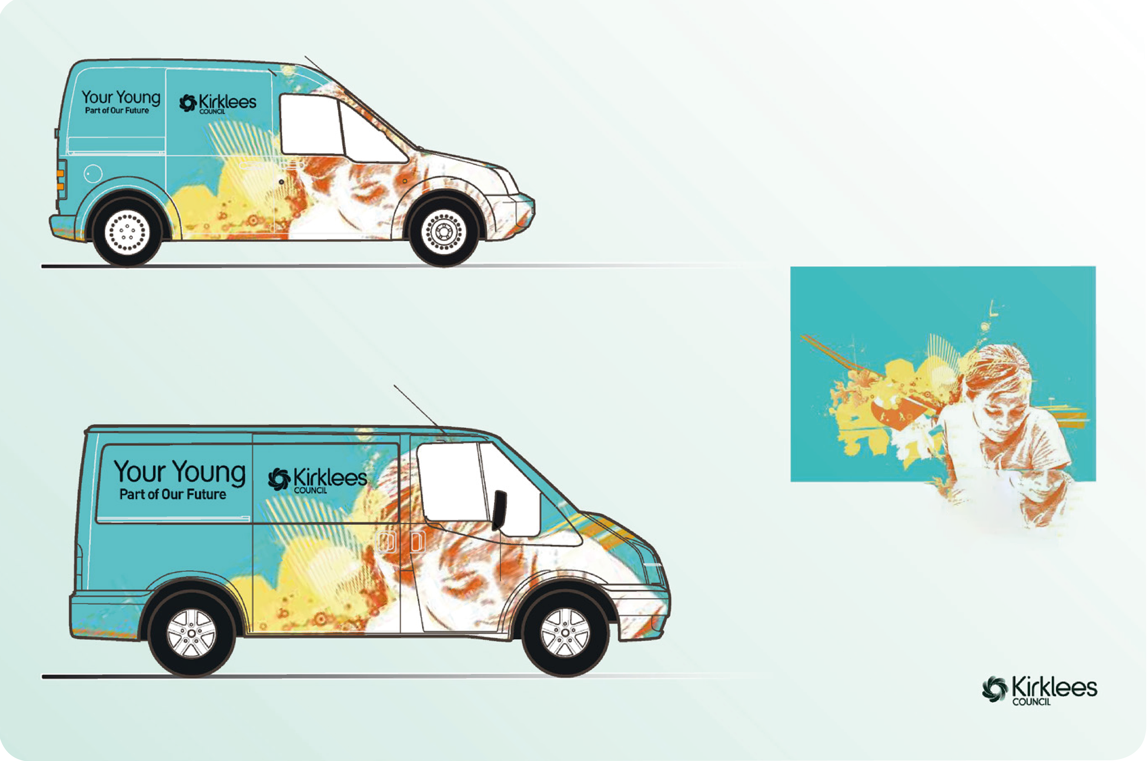
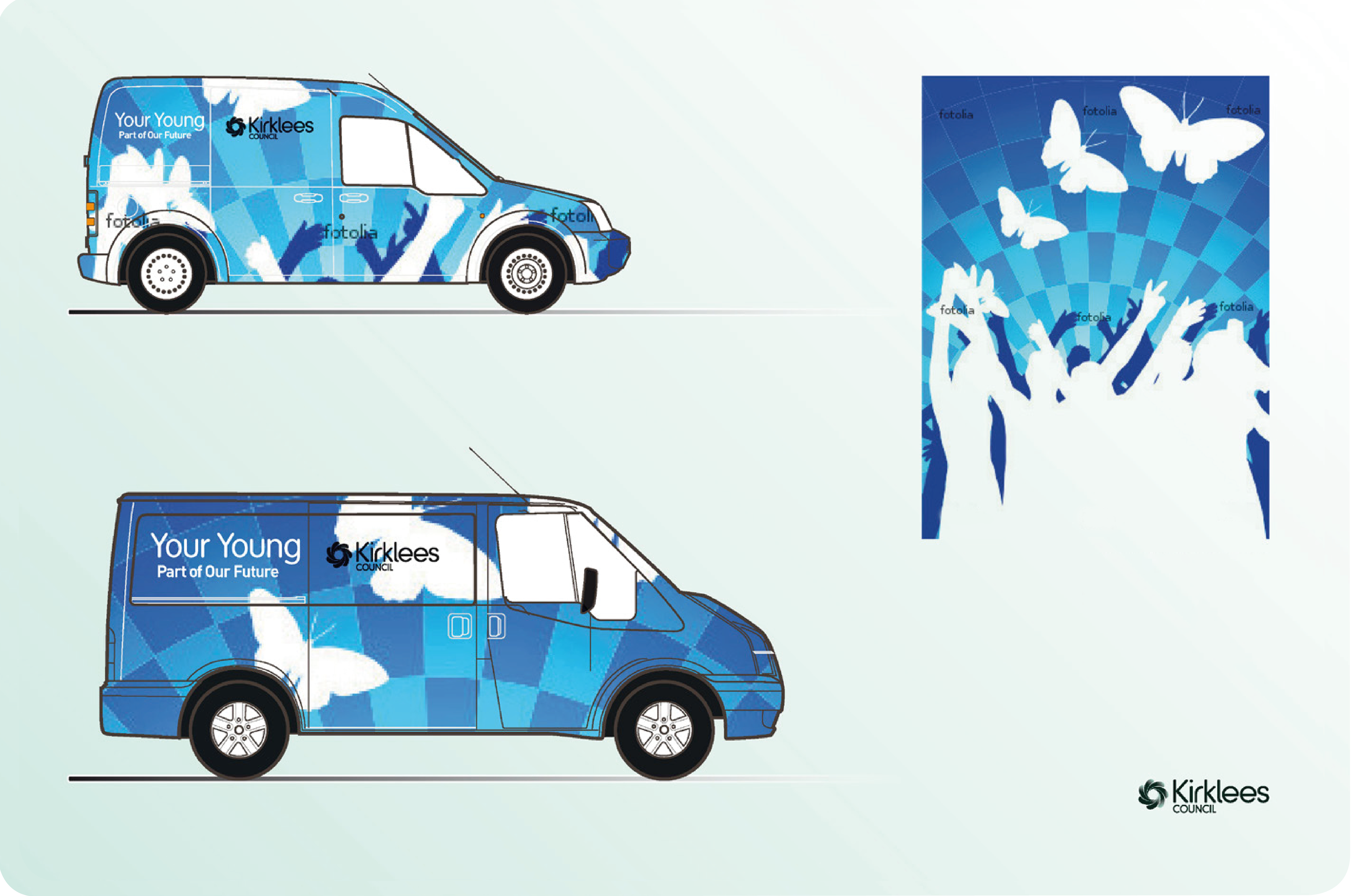
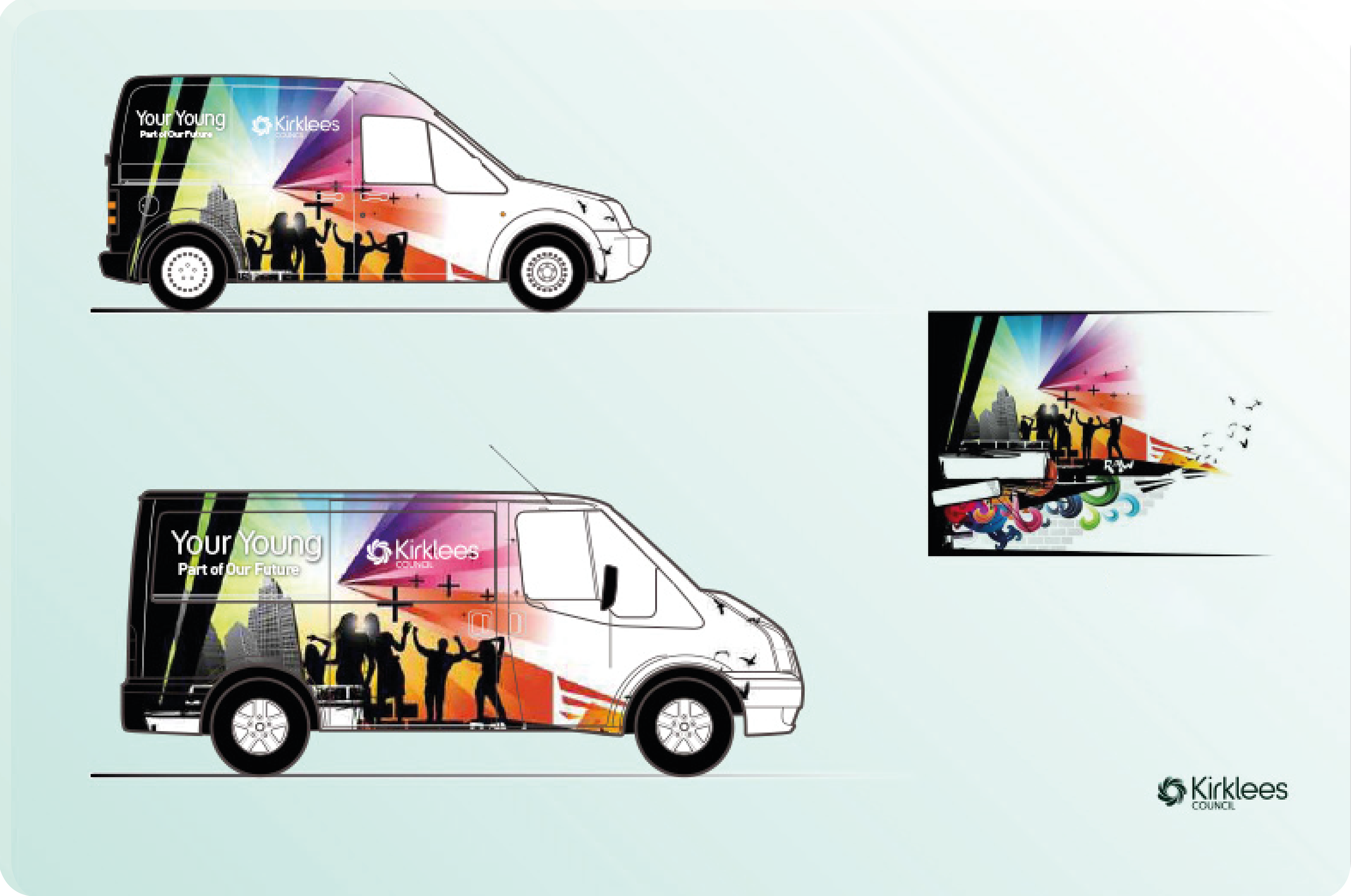
Kirklees Council | Vehicle Wraps |
Your Young: Creating a mobile transport solution for the "Your Young" campaign to reach and engage with young people aged 13-19 in Kirklees was a good initiative, and created a positive vibe within the community. This campaign aimed to bring youth culture to these young individuals and influence them positively regarding their education and job prospects.
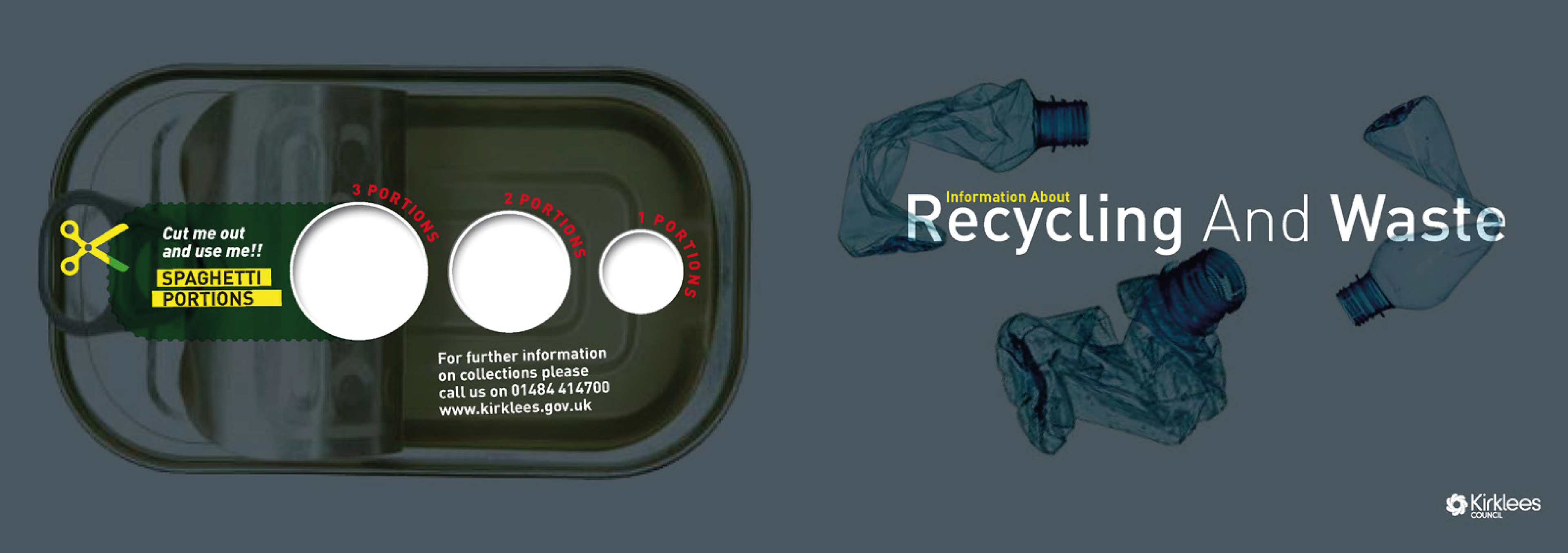
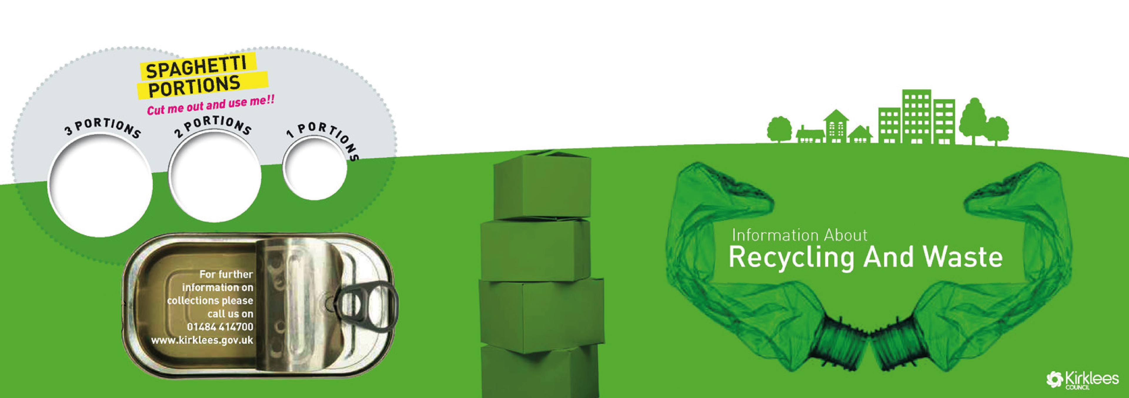
Recycling and Waste | Print & Digital |
Focusing on educating the Kirklees population about the benefits of recycling, not only locally, but also on a global scale. We created a mail-piece that's both informative and engaging was an effective way to get the message across.
We started with an eye-catching design that immediately grabbed the recipient's attention. Using colourful and appealing graphics to make the mail-piece visually appealing and retainable.
We started with an eye-catching design that immediately grabbed the recipient's attention. Using colourful and appealing graphics to make the mail-piece visually appealing and retainable.
CONCEPT | ART DIRECTION | LAYOUT | DESIGN | TYPOGRAPHY | ARTWORK
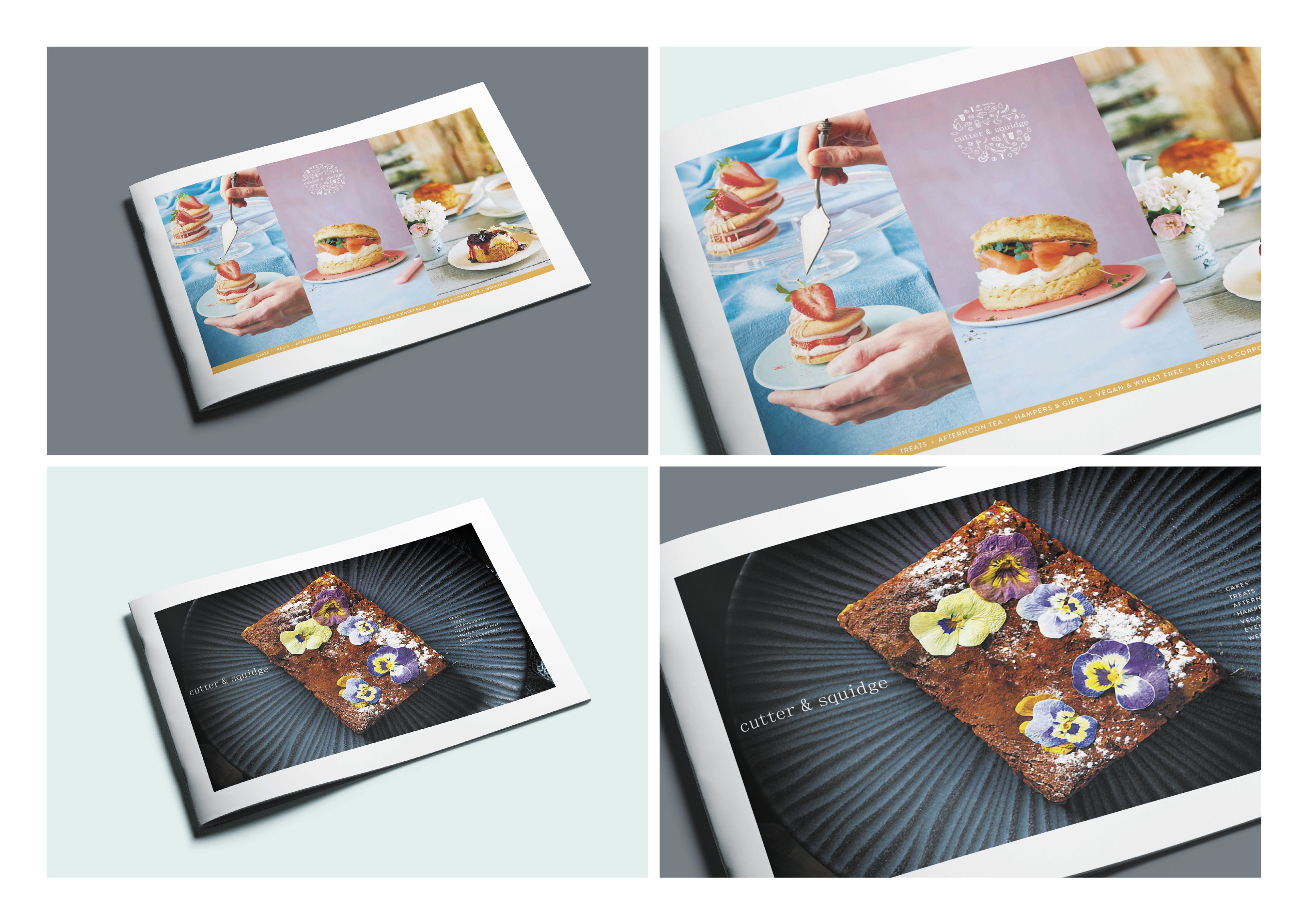
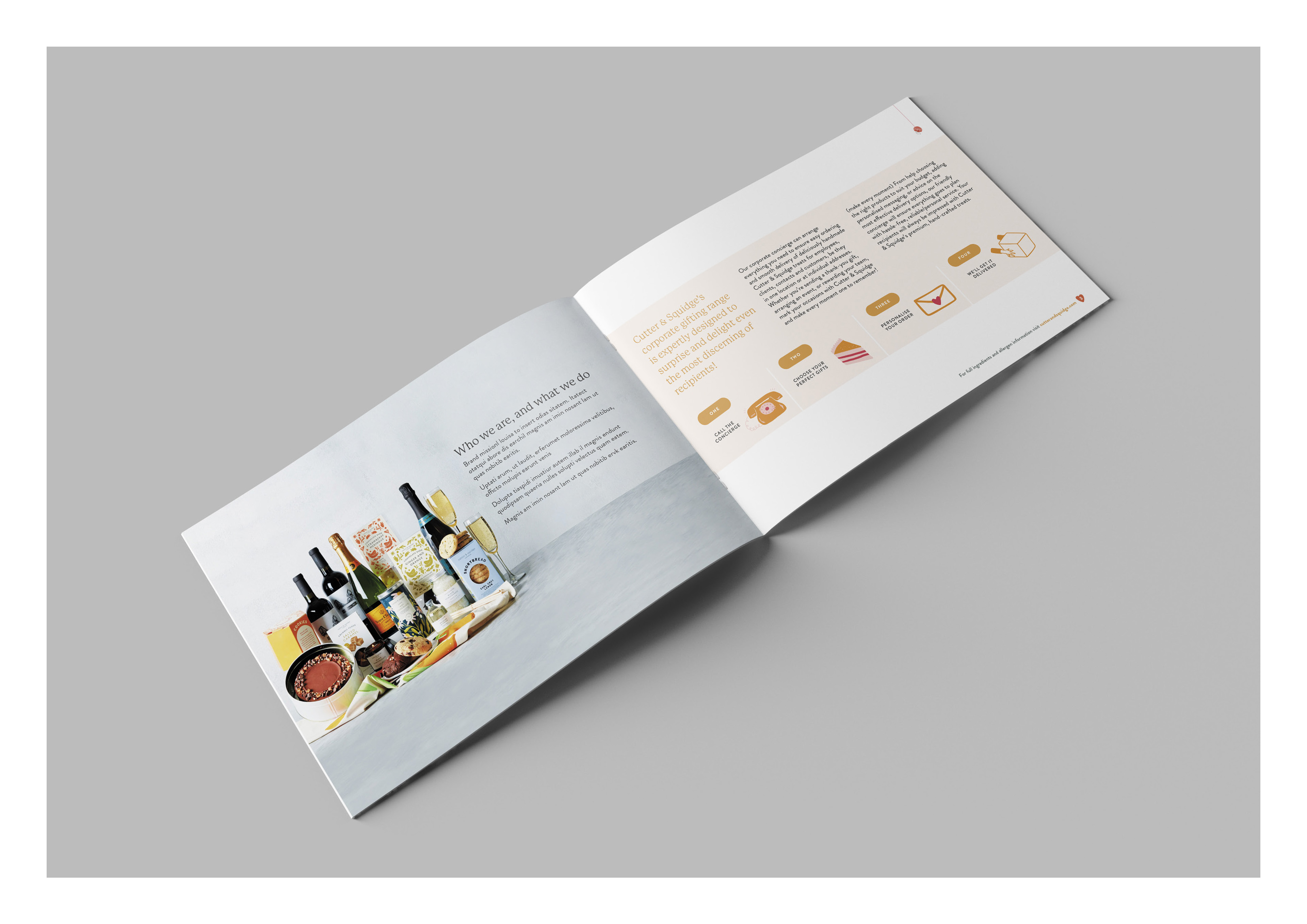
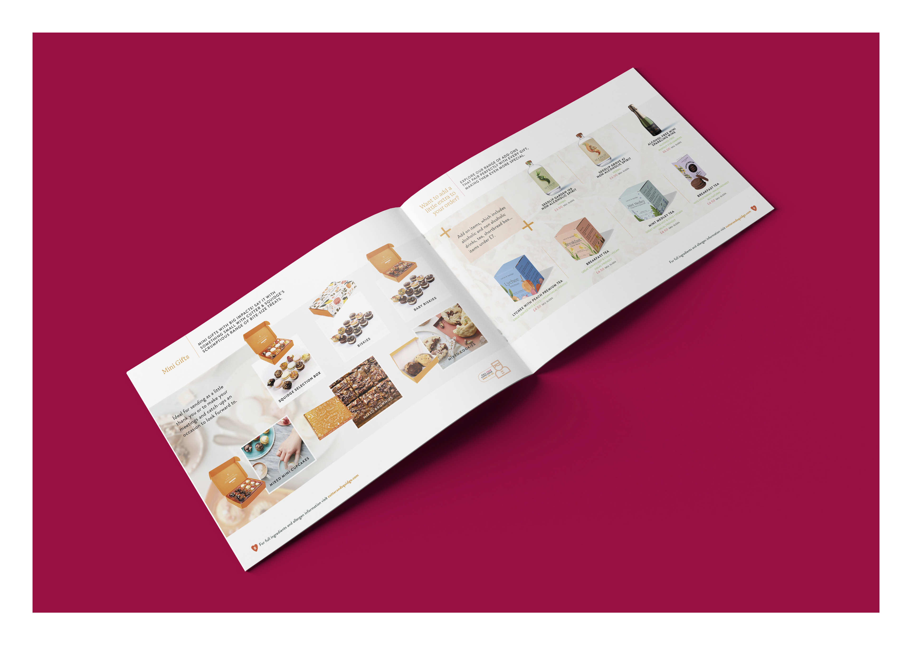
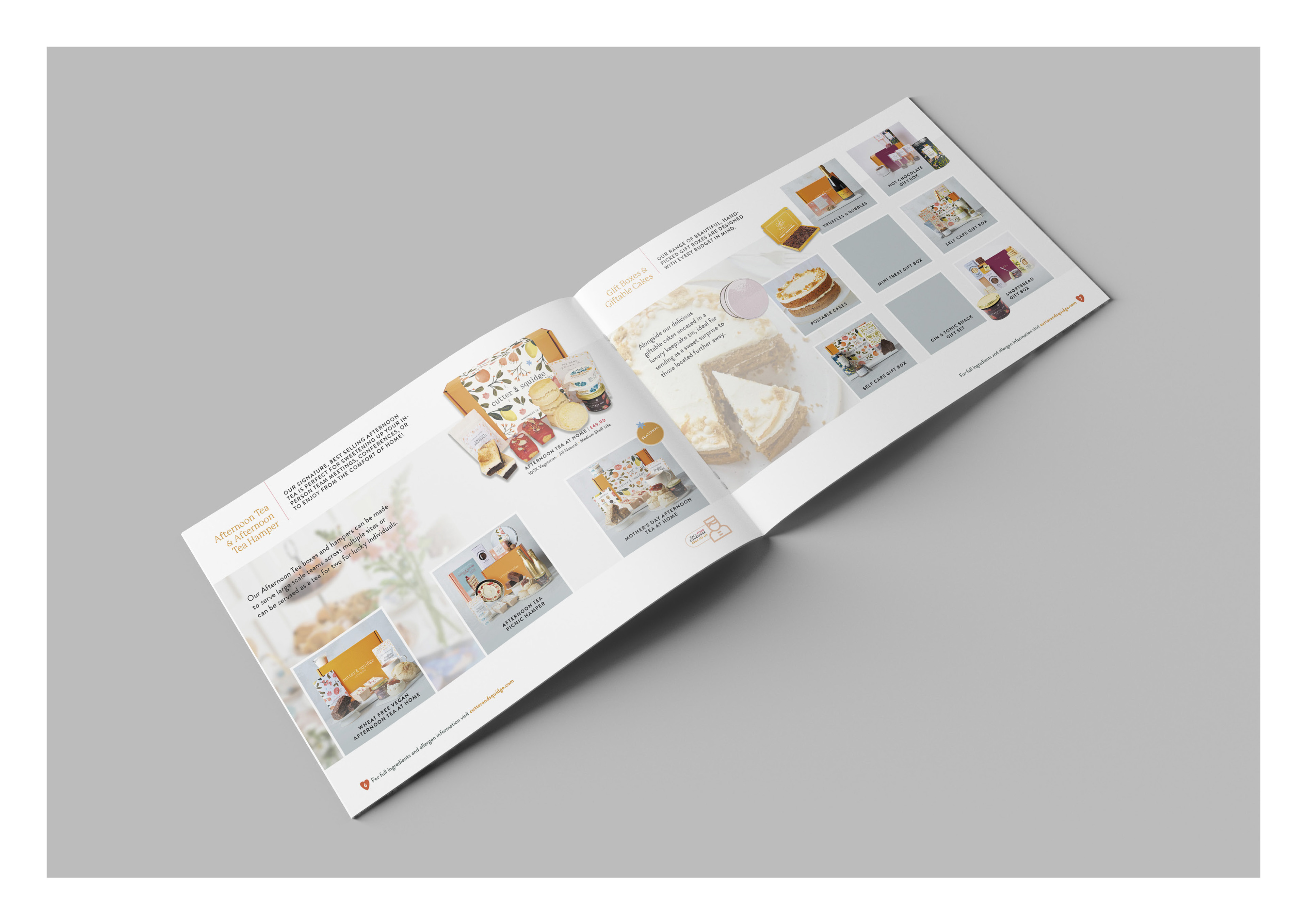
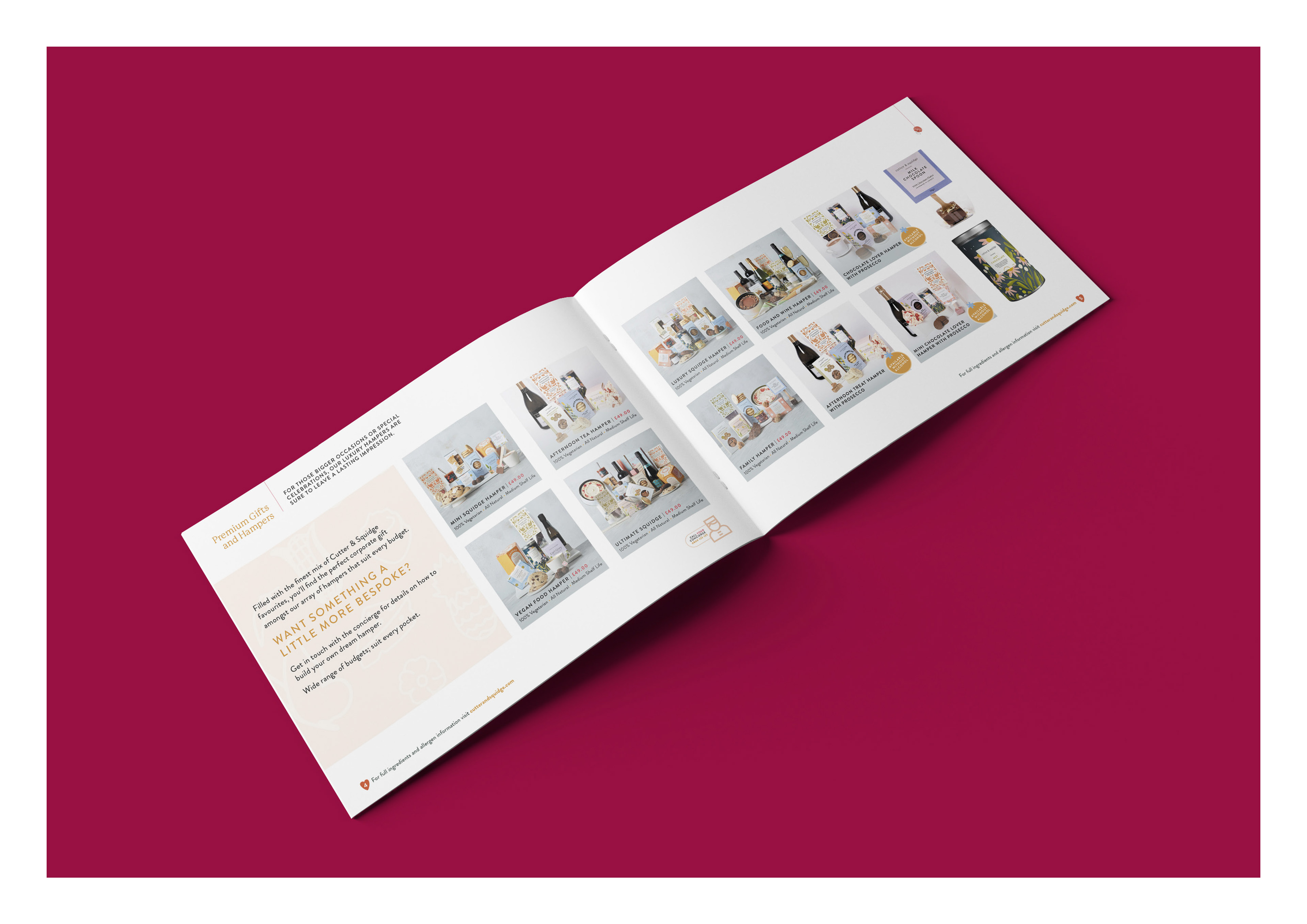
Cutter & Squidge | Product & Gift Brochure |
Designing a bespoke brochure for Cutter & Squidge, a provider of corporate gifts, foods, and hampers, is a great way to showcase their offerings and make the ordering process easy for prospective clients.
Clear brand identity was emphasised on a clean and professional layout that aligns with the client's need for a polished and consistent brand identity. Tailoring the design to the client's specific needs and preferences demonstrates my ability to provide customised solutions.
CONCEPT | ART DIRECTION | LAYOUT | DESIGN | TYPOGRAPHY | ARTWORK
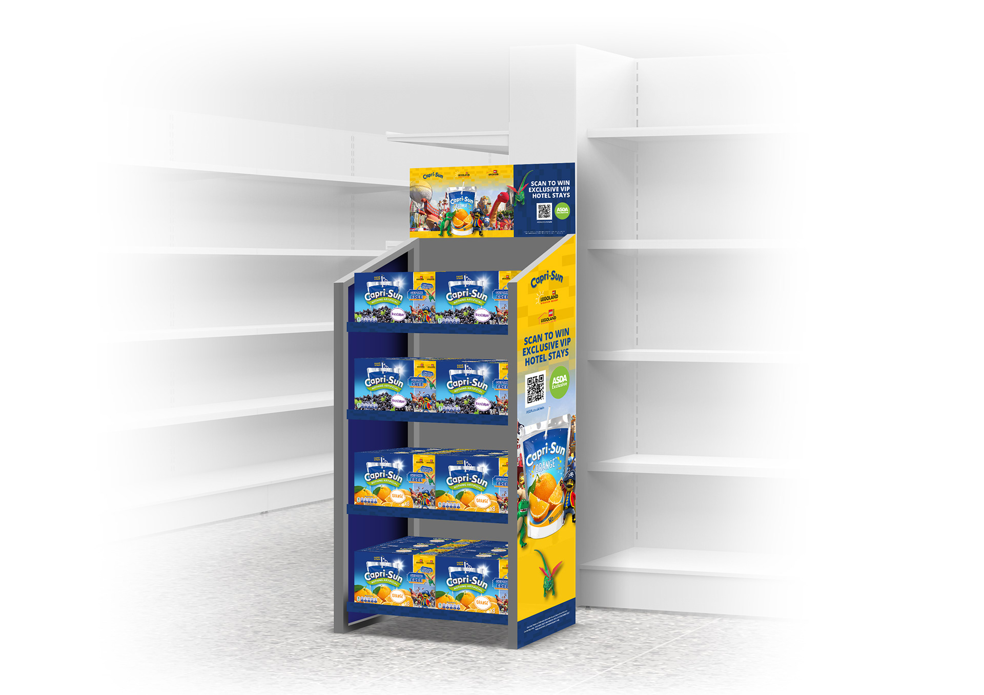
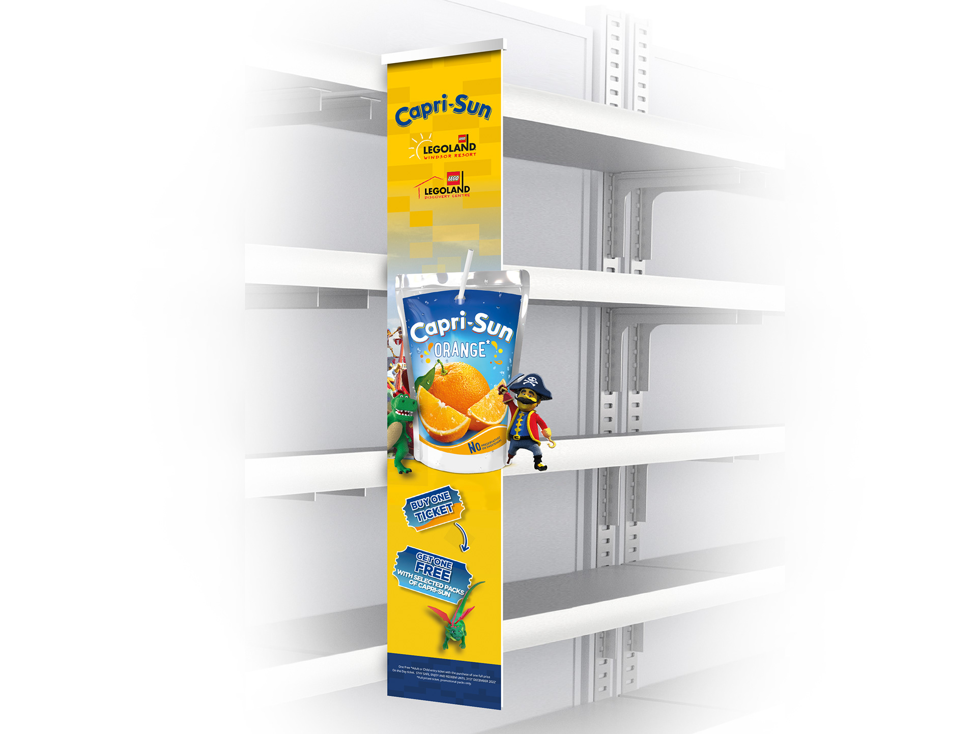
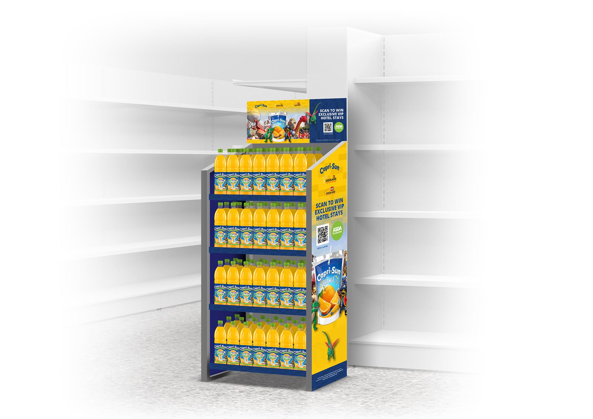
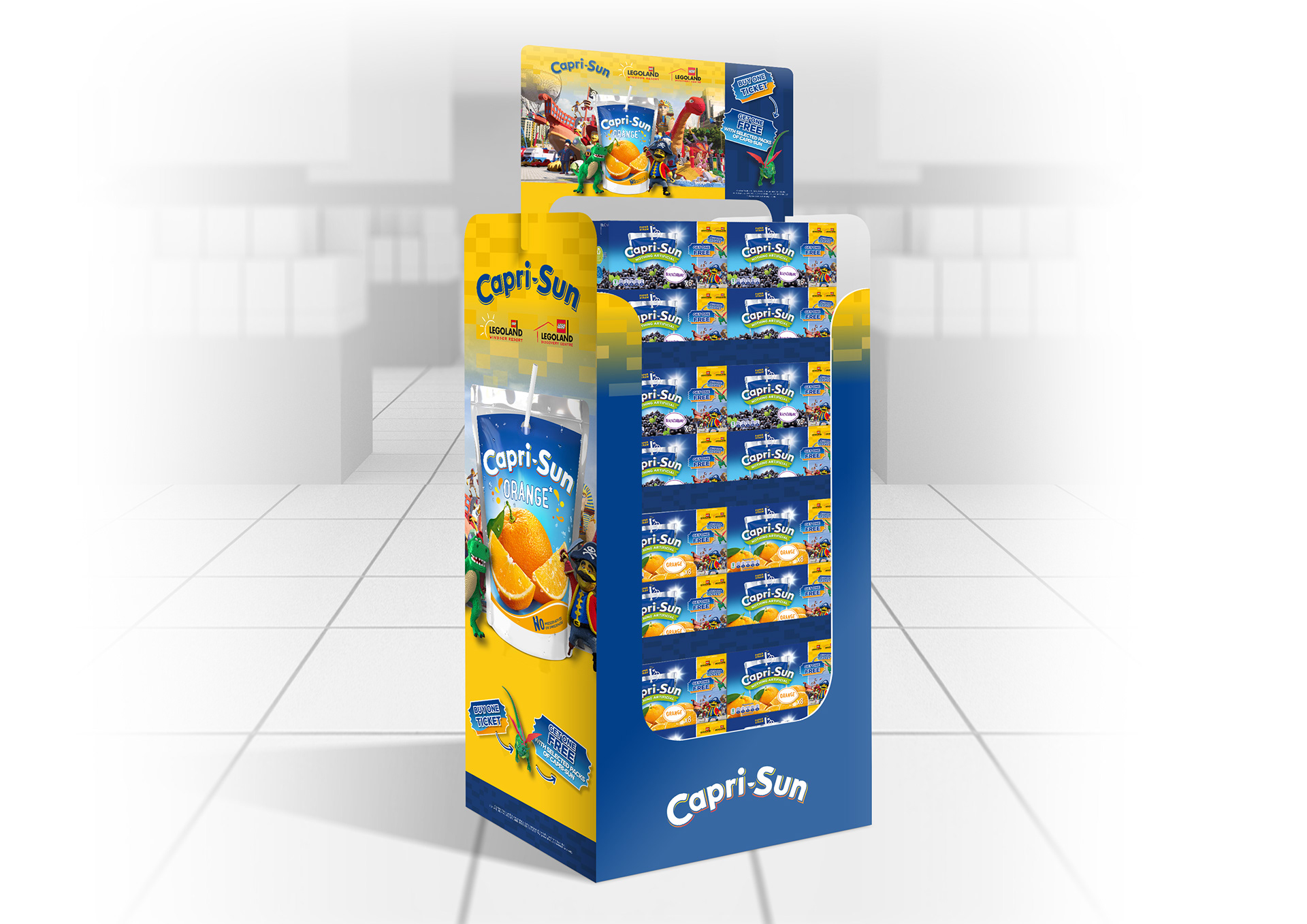
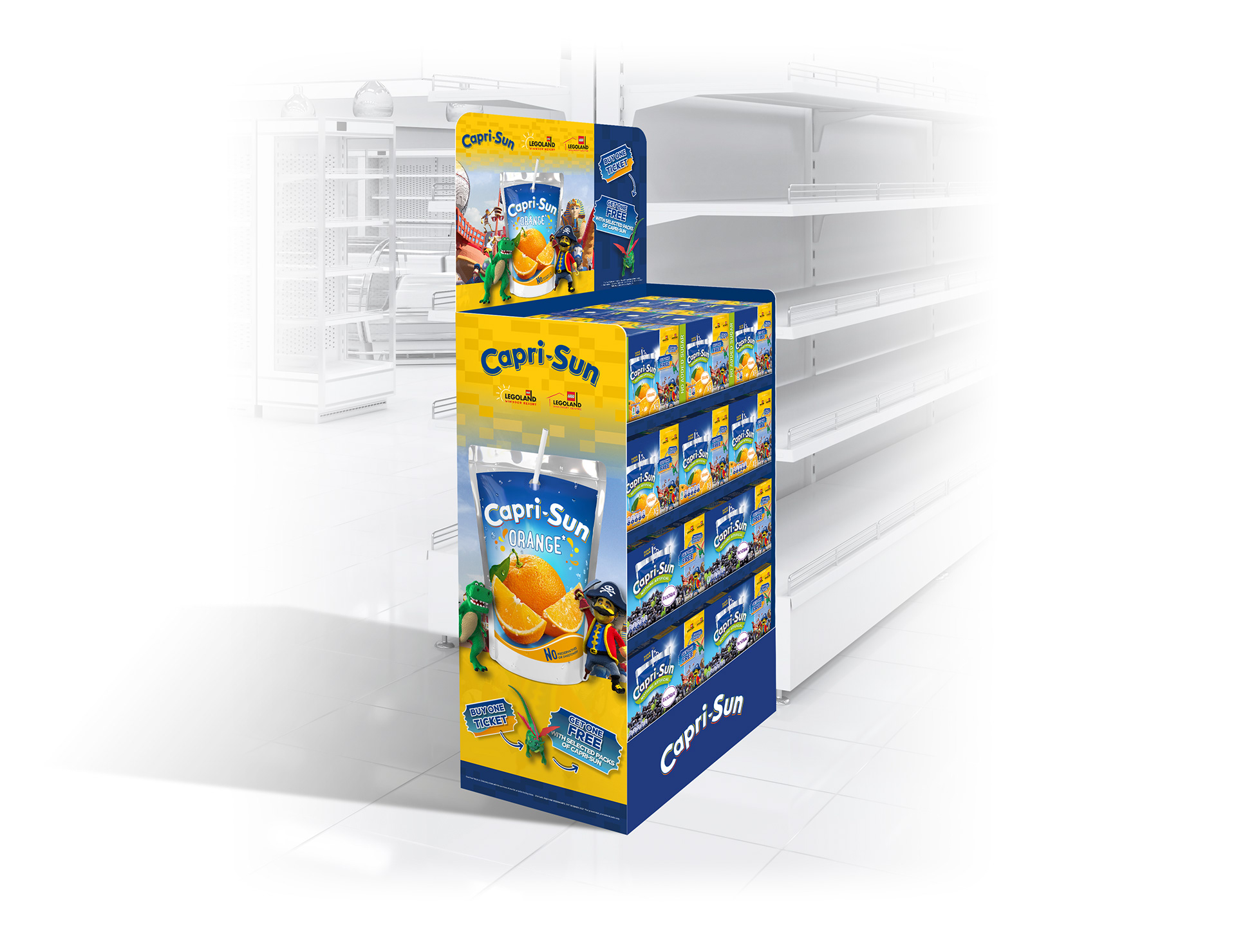
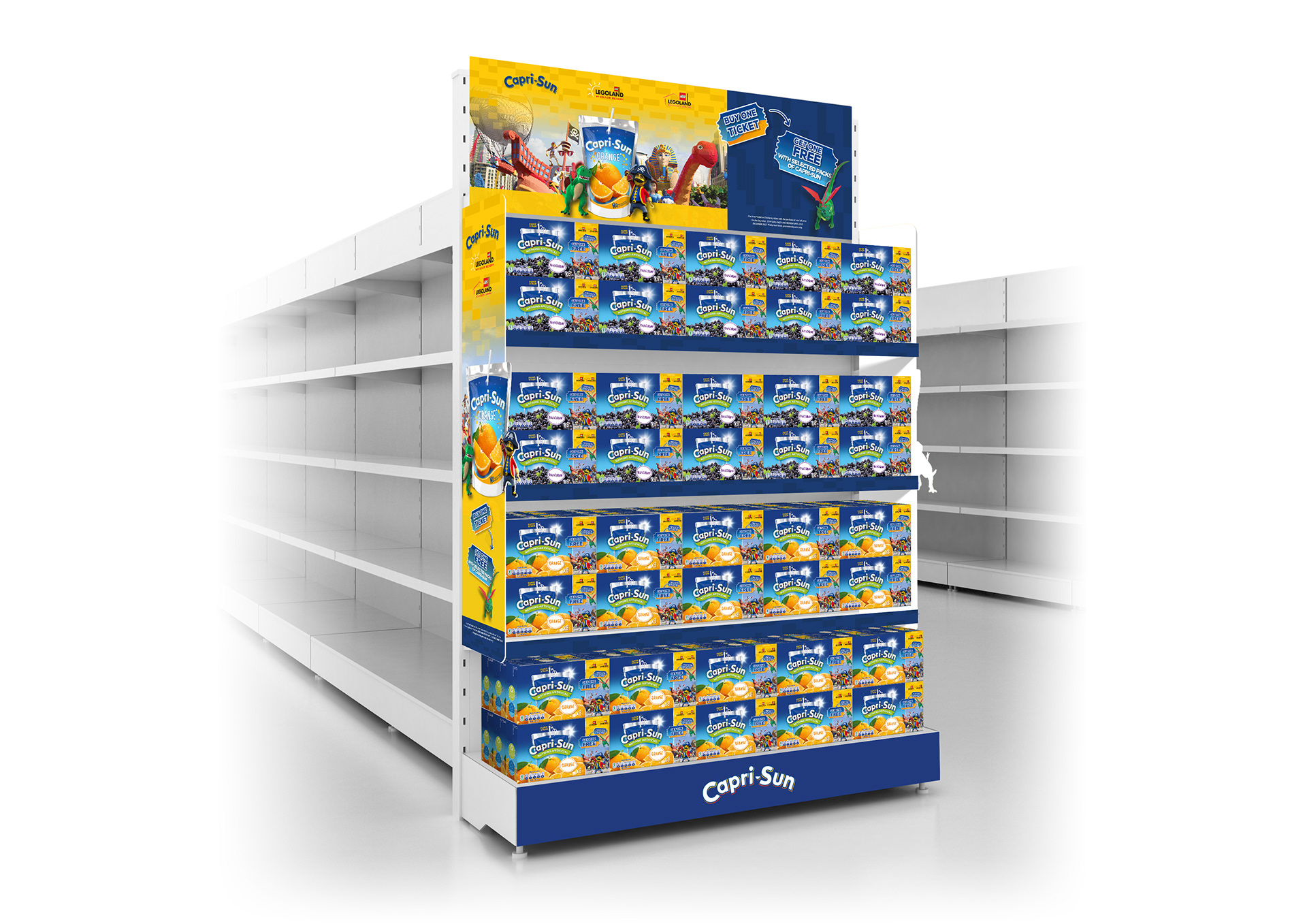
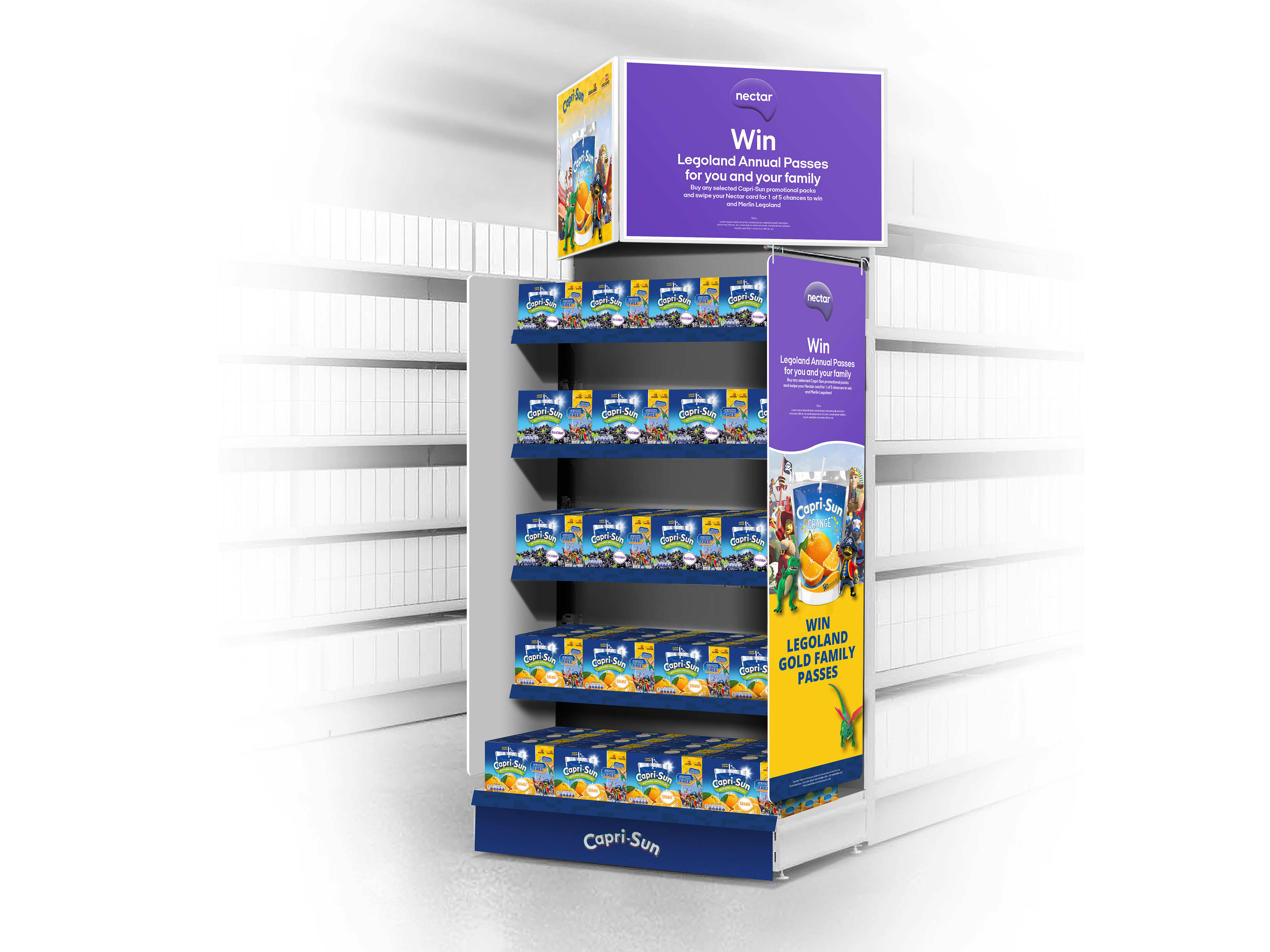
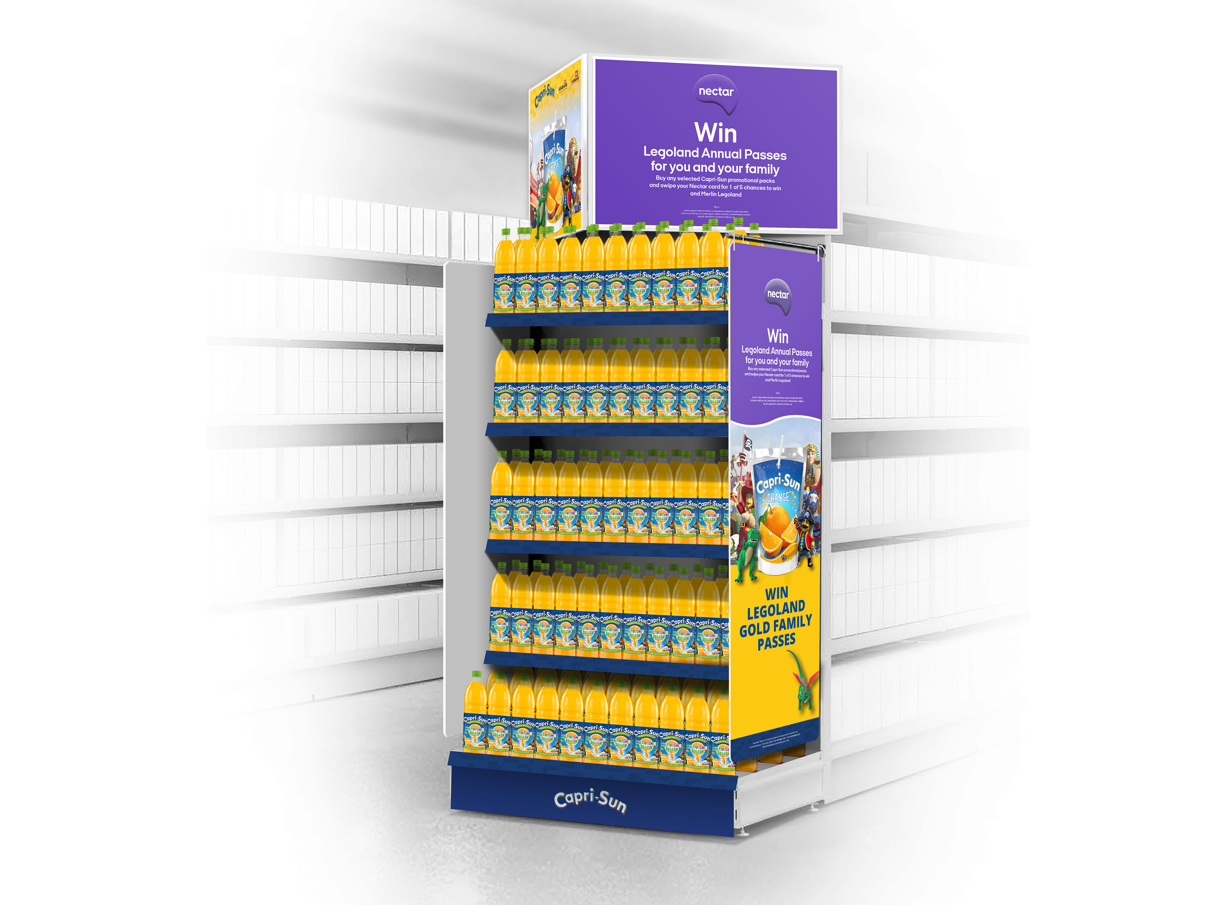
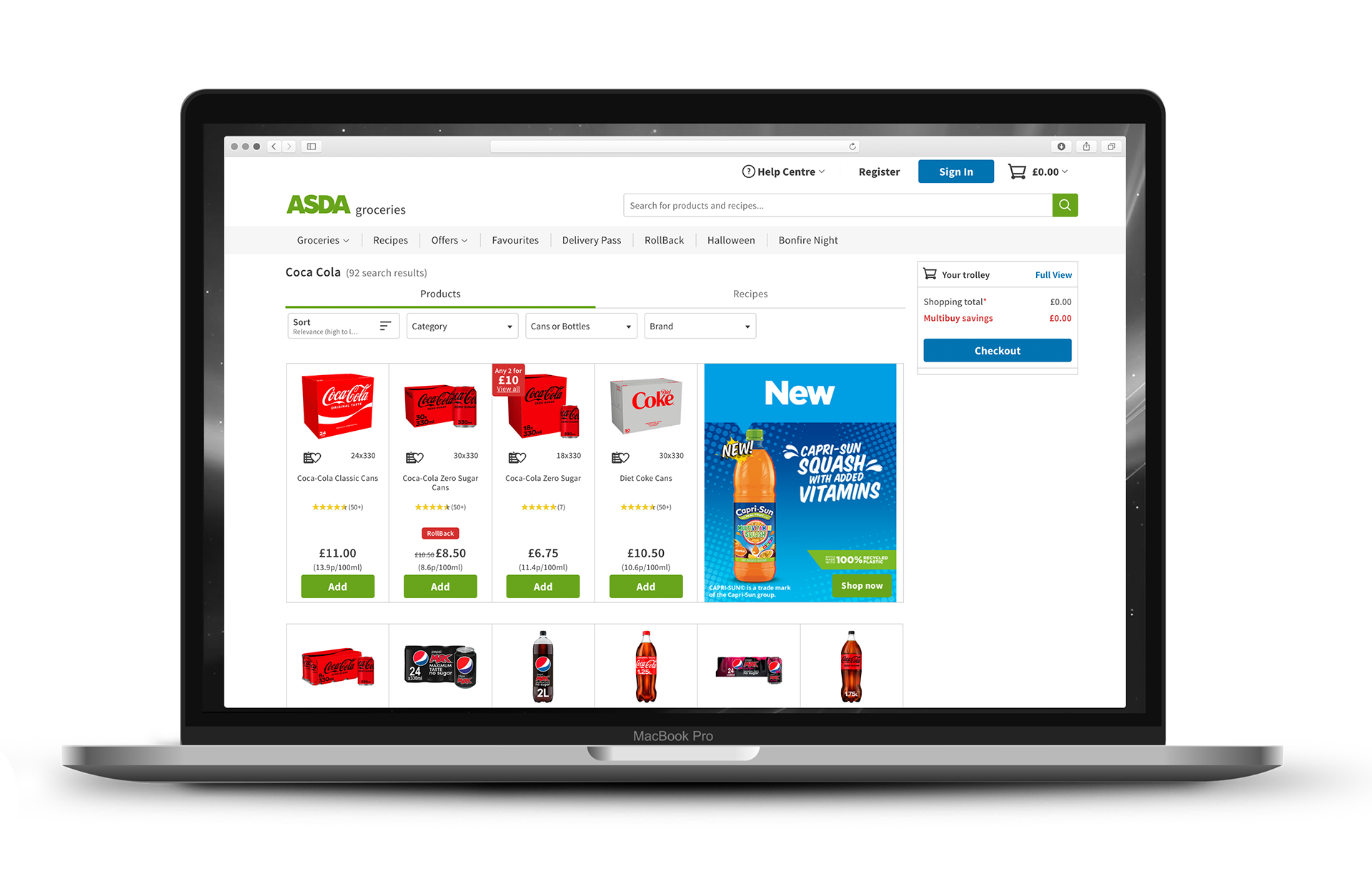
Asda/Sainsbury's | Legoland Promo |
Taking the KVs and manipulating them to create key touch points for Asda and Sainsbury's in Photoshop, then adding to the massive toolkit, was one of the many responsibilities I under took on this job, including adding assets to digital applications.
LAYOUT | MOCK-UP |
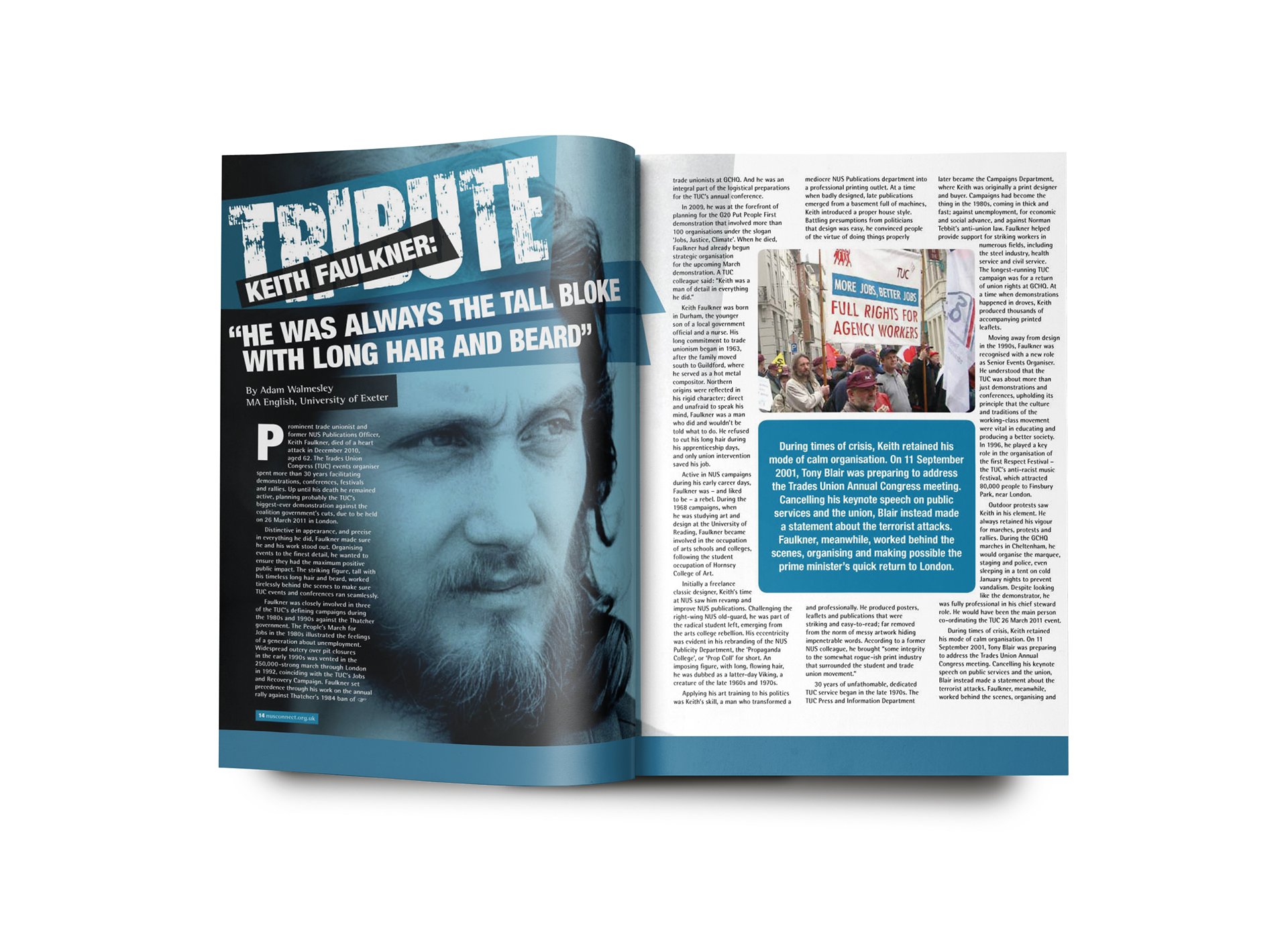
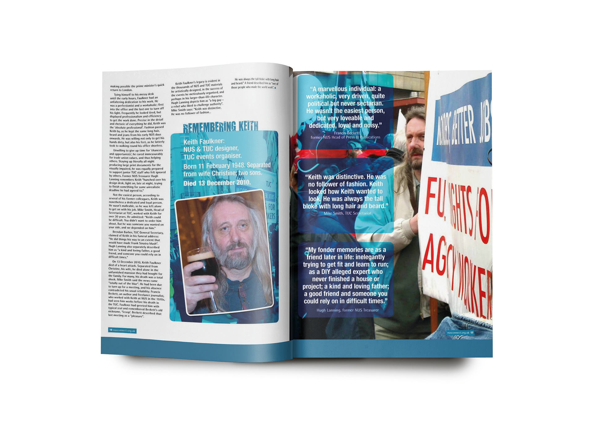
Spotlight Magazine | NUS |
I had a multifaceted role in managing the design and layout aspects of Spotlight Magazine. My responsibilities involved creating visually appealing layouts for editorial content and structuring documents for advertisements provided by clients. Additionally, I handled Photoshop work to enhance and rescue images, ensuring they met the required quality standards
Develop visually engaging layouts for editorial content. Ensure a cohesive and aesthetically pleasing design throughout the magazine or newsletter. Advertisement Integration was key, so organising and structure of the document to seamlessly incorporate client-supplied advertisements was crucial, to make a harmonious reader experience.
CONCEPT | ART DIRECTION | LAYOUT | DESIGN | TYPOGRAPHY | ARTWORK
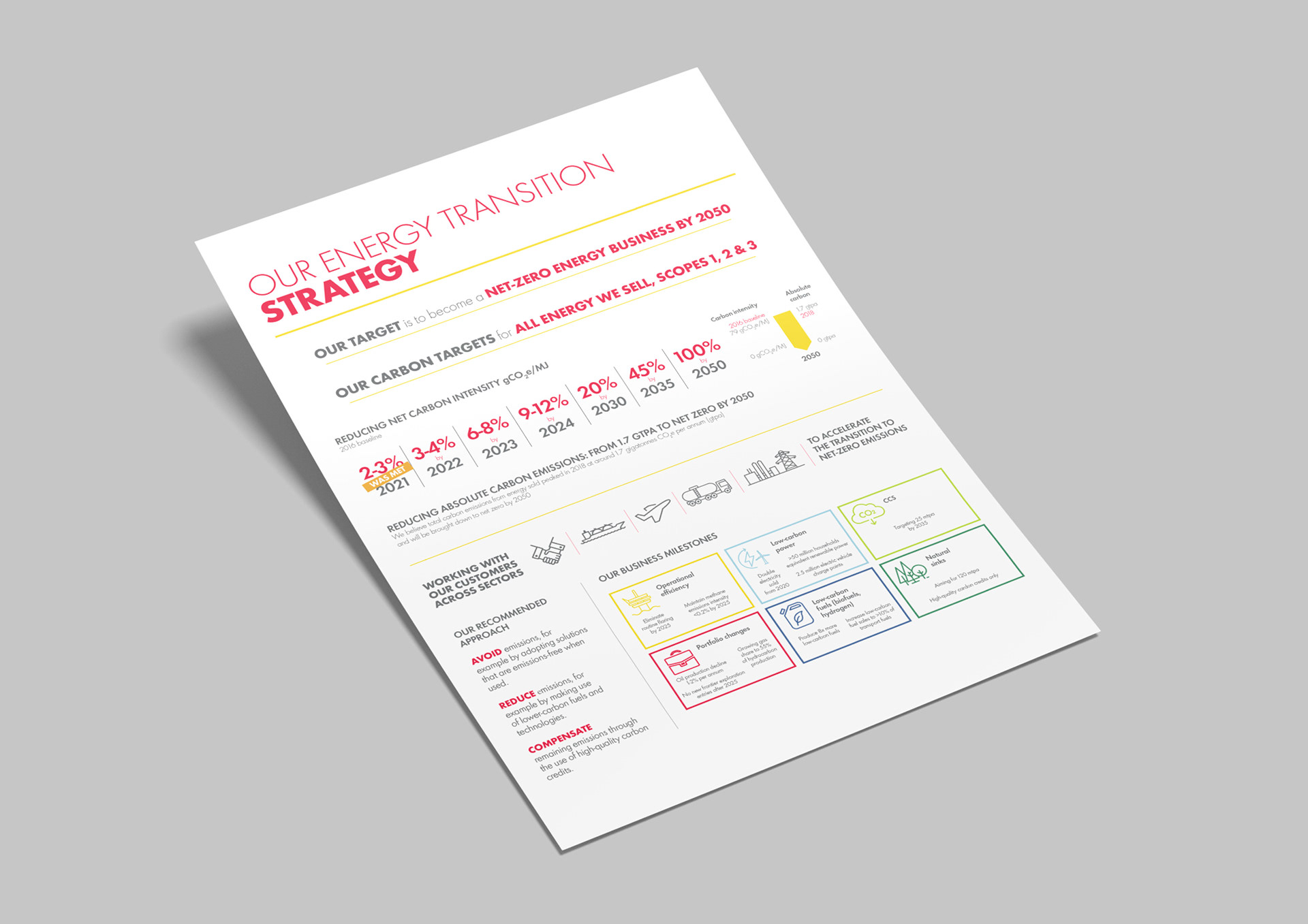
Shell | White Paper |
I was assigned to develop a concise and professionally presented 'white paper'. I utilised infographics, maintained a simple and clean colour scheme, and prioritised ample white space for effective communication.
CONCEPT | ICON CREATION | LAYOUT | DESIGN | TYPOGRAPHY | ARTWORK